


How to create a sunburst chart in Tableau

The sunburst chart is ideal for displaying hierarchical data. Each level of the hierarchy is represented by one ring with the innermost circle as the top of the hierarchy. Let us then see how to build step-by-step a sunburst chart on Tableau. Our goal is to create a graph showing sales for each category, sub […]
How to create error bars in Tableau

Error bars help to indicate estimated error or uncertainty to give a general sense of how precise a measurement is. Let’s now see how to build step-by-step error bars on Tableau. Our goal is to create a chart showing sales margins per month from Sample Superstore data. Step 1. Create error bars Connect to the […]
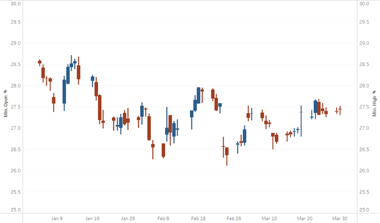
How to create a candlestick chart (II) in Tableau
Candlestick charts are often used in finance to analyse price movements over time. Let us then see how to build step-by-step progress a candlestick chart on Tableau. Step 1. Create the candlestick chart Connect to the data source (in this case we are not using Sample Superstore). Right click on Date in the data pane. […]
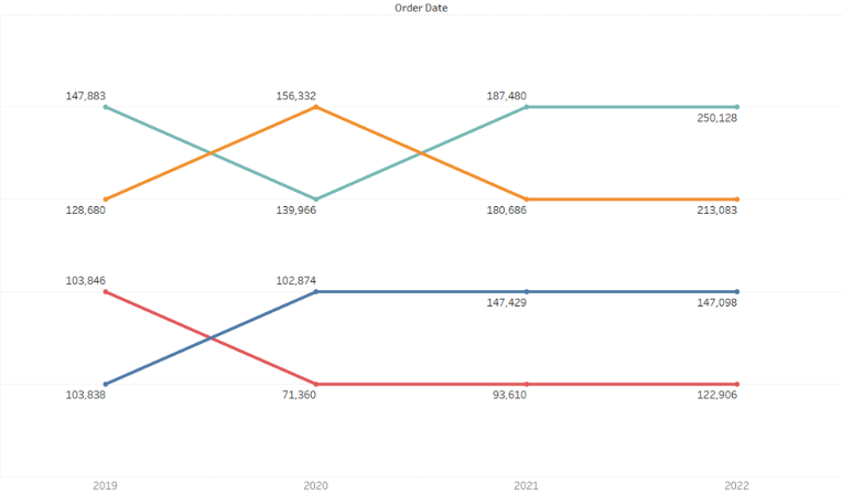
How to create a Dumbbell chart in Tableau

A Dumbbell chart allows you to compare two points in a series that are on the same axis. Let’s now see how to build step-by-step a Dumbbell chart on Tableau. Our goal is to create a chart showing sales per sub category in two different years from Sample Superstore data. Step 1. Create a dumbbell […]
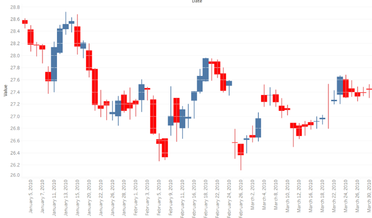
How to create a candlestick chart (I) in Tableau
Candlestick charts are often used in finance to analyse price movements over time. Let us then see how to build step-by-step progress a candlestick chart on Tableau. Step 1. Create the candlestick chart Connect to the data source (in this case we are not using Sample Superstore). Drag Open on Rows. Right click on it […]
How to create a progress bar donut chart in Tableau

A progress bar donut chart is perfect for visualizing your data against a target and measure its progress. Let us then see how to build step-by-step progress bar donut chart on Tableau. Our goal is to create a graph showing profit ratio per region from Sample Superstore data. Step 1. Create the progress bar Connect […]
How to create a bump chart in Tableau
A bump chart is a special type of line graph. It is perfect for visualizing your data in ranks and easily compare performance and trends over time. Let us then see how to build step-by-step bump chart on Tableau. Our goal is to create a graph showing sales per region from Sample Superstore data. Step […]
How to create a rounded bar chart in Tableau
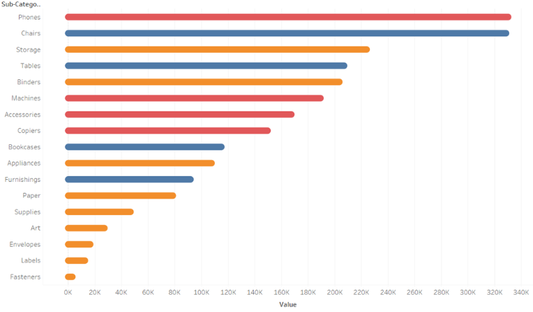
A bar chart is perfect for visualizing your data according to different categories or subgroups. To construct a bar graph, one variable must be quantitative and the other qualitative. Let us then see how to build step-by-step rounded bar graph on Tableau. Our goal is to create a graph showing sales for each category and […]
How to create a timeline in Tableau
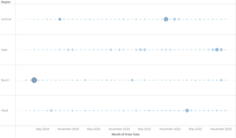
Creating a timeline on Tableau can be a great way to visualize a trend in a given period of time. In this case we will create a timeline showing sales per region over a period of time from the Sample superstore data source. Let us then see how to build step-by-step a calendar on Tableau. […]