


A Dumbbell chart allows you to compare two points in a series that are on the same axis.
Let’s now see how to build step-by-step a Dumbbell chart on Tableau. Our goal is to create a chart showing sales per sub category in two different years from Sample Superstore data.
Step 1. Create a dumbbell chart
- Connect to the data source Sample – Superstore.
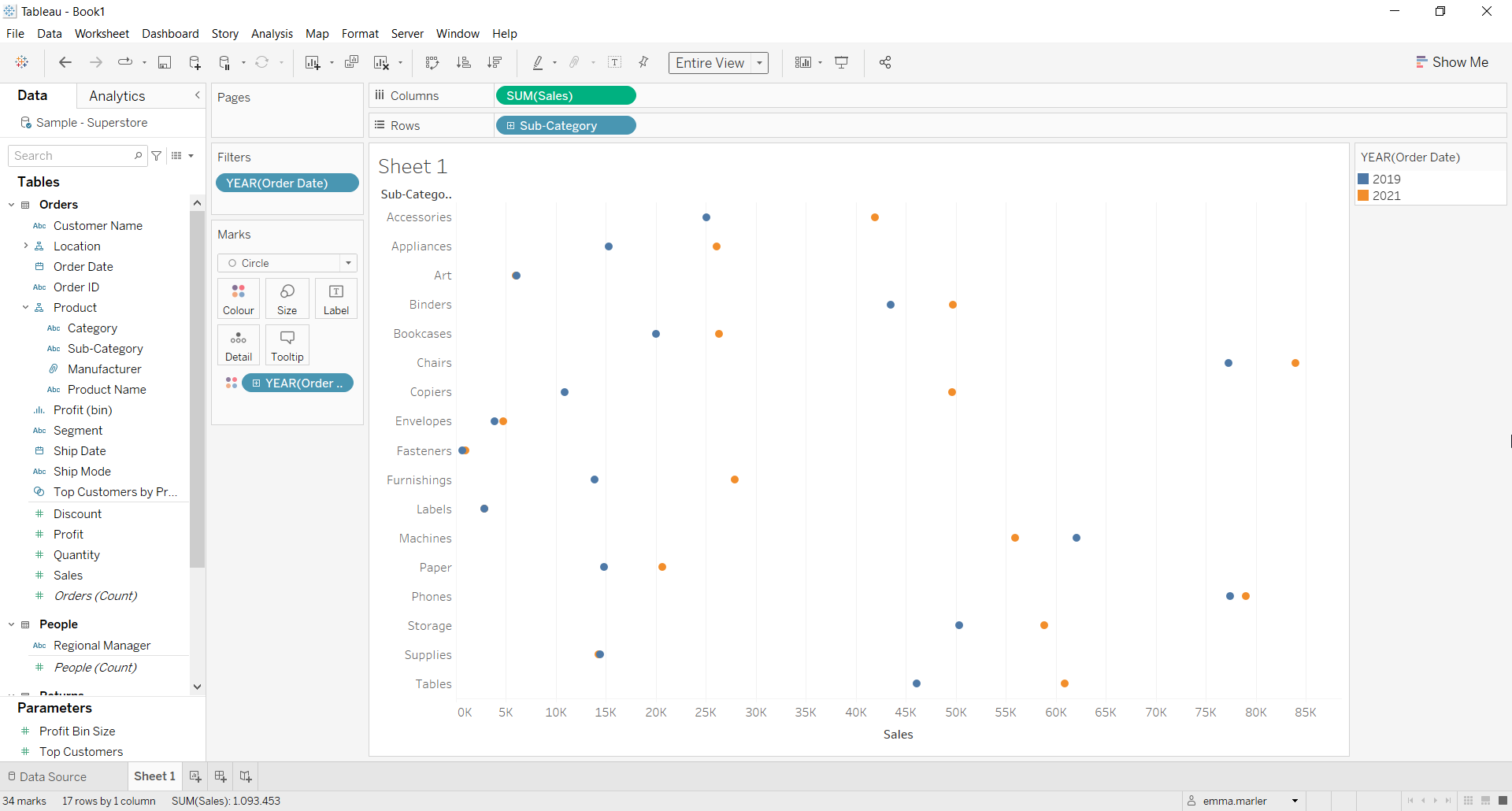
- Drag Sales to Columns.
- Drag Sub-category to Rows. Tableau will automatically create a bar chart.
- Drag Order Date on Filters. Select Years and then 2019 and 2021 when the window pops up.
- Drag Order Date to Color in the Marks card.
- Select Circle from the dropdown menu in the Marks card. Fit to Entire view.
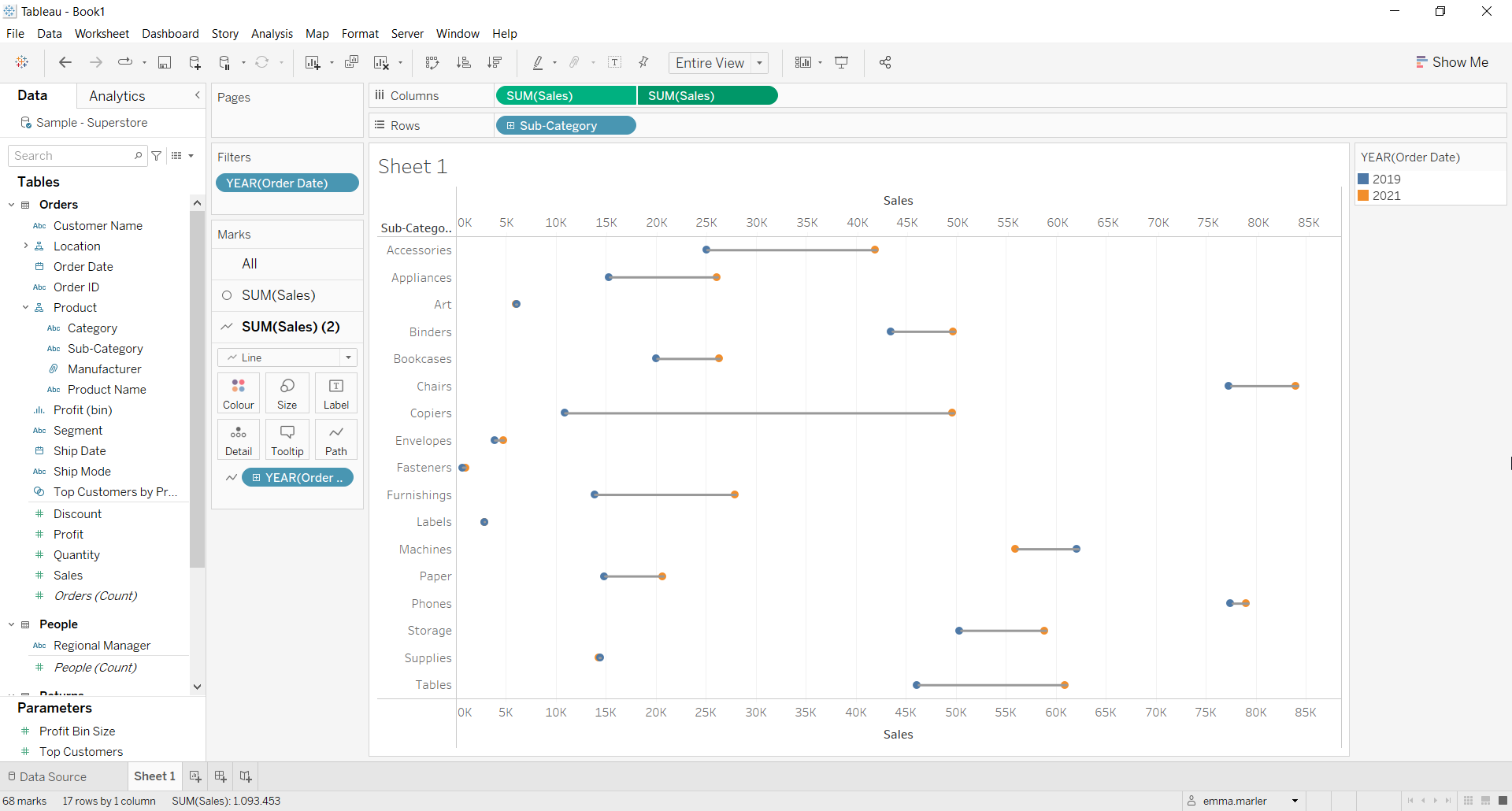
- Drag Sales to Columns again.
- Select the Marks card SUM (Sales) (2). Select Line in the dropdown menu.
- Click on where blue circle is in the picture below and choose Path.

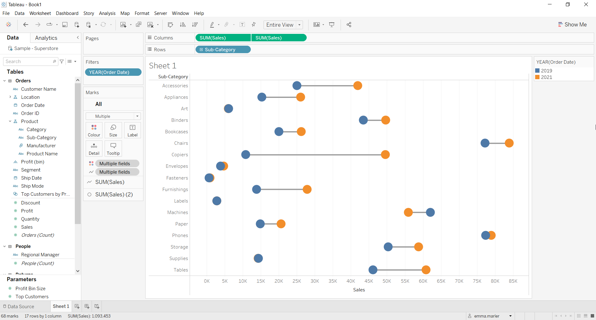
- Right click on the second Sales tab in Columns and select Dual axis. This is show your view should look now.
- Right click on the Sales x axis at the bottom and select Synchronize axis.
- Invert the order of the two Sales tabs in Columns.
- Right click on the Sales x axis at the top and select Show header.
- Select the Marks card SUM (Sales) (2) and make the size of the dots bigger. Done!
Don’t wait! Contact us to learn more and continue to follow upcoming news on our website and LinkedIn channel.