


The Waffle Chart is a type of chart whose grid structure allows for an effective representation of the incidence of one or more parts on the total. Among its main strengths are the square shape that allows it to be easily inserted within dashboards and the ease with which users can interpret it. However, as with other charts that break down the total into multiple parts highlighting the impact of each, in this case, it is necessary to be careful with the number of components highlighted. Indeed, although easy to understand, it becomes difficult to comprehend when characterized by too many categories.
In this article, we will discover how to easily build a Waffle Chart in Tableau in a few simple steps. Specifically, we will consider the case where we want to show how much the sales of one or more regions impact the total sales. We will do this using the data from Sample – Eu Superstore and a support sheet.
Waffle Chart: Guide to Building with a Single Category
To easily build a Waffle Chart in Tableau, it is necessary to use a support sheet that we can easily download from this link.
After downloading the file, just follow these steps to obtain the visualization.
1) Open Tableau and choose Sample – EU Superstore as the data source
2) Click on Data and then on New Data Source to import the previously downloaded Excel file Waffle_Chart_template
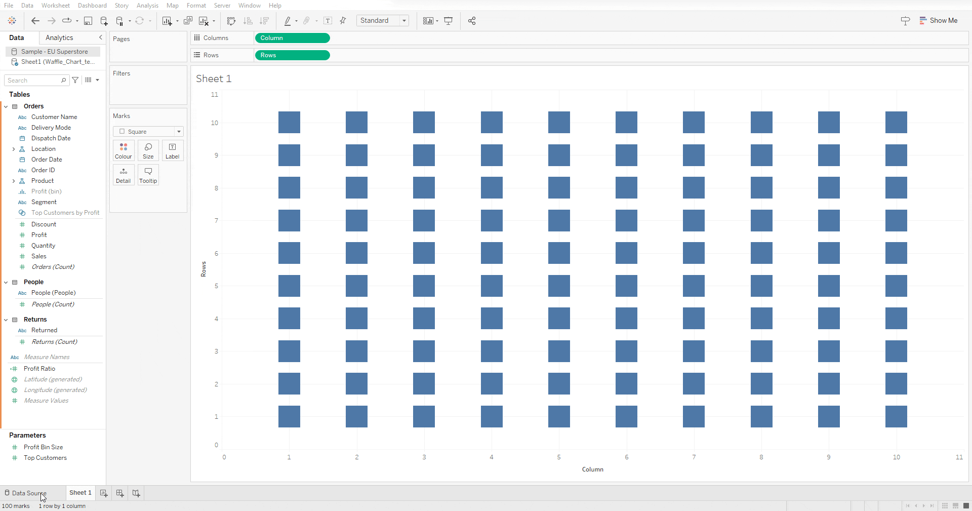
3) Drag Column and Rows respectively into columns and rows and then transform them first into discrete and then into dimensions
4) Choose square as marks and resize slightly
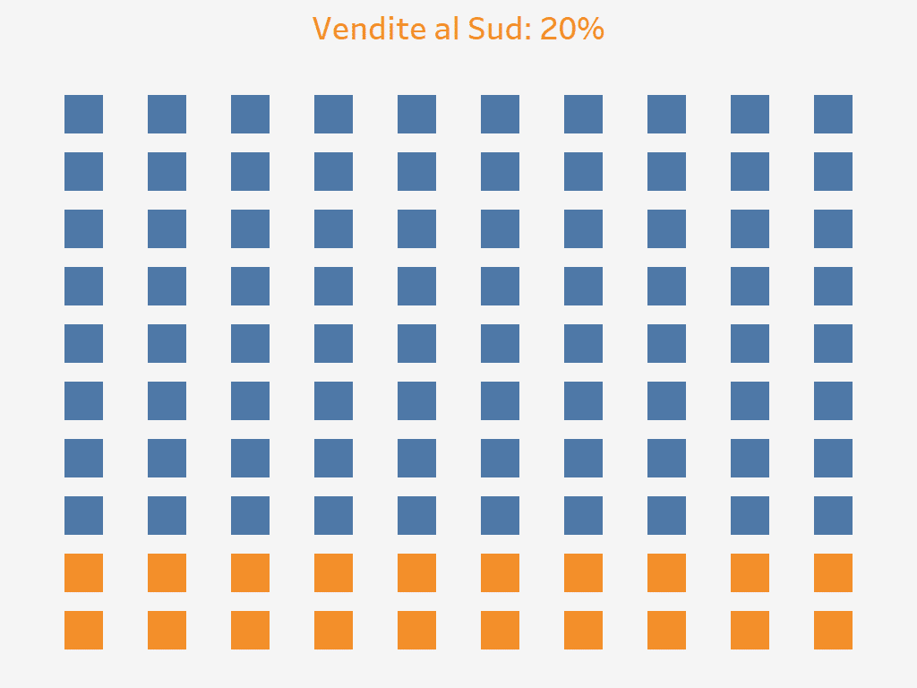
5) Click on the Sample – EU Superstore data source and create the calculated field “Vendite Sud” (South Sales). Inside this field, insert the code `SUM(IF [Region] = “South” THEN [Sales] END) / SUM([Sales])`. This calculated field is used to determine the proportion of total sales that come from the South region
6) Create another calculated field called “Colore” (Color) to ensure that the Waffle is colored based on the calculation from the previous step. In this calculated field, write `[Vendite Sud] >= SUM([Sheet1 (Waffle_Chart_template)].[Percentage])`
7) Drag the calculated field “Colore” (Color) into the Color shelf
8) Right-click on a white space of the page, select Format, then go to Lines, and set the Grid Lines value to None
9) Hide the axes by right-clicking on them and then selecting Show Header to toggle it off
10) Select your preferred background color, and after bringing the calculated field “Vendite del Sud” (South Sales) into detail, insert it into the title, and you will have constructed your Waffle Chart
Waffle Chart in Tableau: construction with multiple categories
If you want to build a Waffle Chart with multiple categories, you just need to follow some of the steps previously seen along with a few additional steps. Specifically:
1) Open Tableau and choose Sample – EU Superstore as the data source
2) Click on Data and then on New Data Source to import the previously downloaded Excel file Waffle_Chart_template
3) Drag Column and Rows respectively into columns and rows and then transform them first into discrete and then into dimensions
4) Choose square as marks and resize slightly
5) Create the calculated field “North” with the code SUM (IF[Region]= “North” THEN[Sales] END) / SUM([Sales])
6) Create the calculated field “Central” with the code SUM (IF[Region]= “Central” THEN[Sales] END) / SUM([Sales])
7) Create the calculated field “South” with the code SUM (IF[Region]= “South” THEN[Sales] END) / SUM([Sales])
8) Create the calculated field “Sales” with the code IF AVG(([Sheet1 (Waffle_Chart_template (1))].[Rows]*10)-(10-[Sheet1 (Waffle_Chart_template)].[Column])) <= ROUND(([North])*100) THEN “Noth”
ELSEIF AVG(([Sheet1 (Waffle_Chart_template)].[Rows]*10)-(10-[Sheet1 (Waffle_Chart_template)].[Column])) <= ROUND(([Central]+[North])*100) THEN “Central”
ELSE “South”
END
9) Bring the Sales field into Color
10) Right-click on a white space of the page, select Format, then go to Lines, and set the Grid Lines value to None
11) Hide the axes by right-clicking on them and then selecting Show Header to toggle it off
12) Select your preferred background color, and after bringing the calculated fields “North”, “Central”, and “South” into detail, insert them into the title, and you will have constructed your Waffle Chart with multiple categories

Conclusions
Through a few simple steps, we have successfully created two waffle charts. This type of chart allows us to easily understand how much a part contributes to the total and can be easily integrated into complex dashboards thanks to its shape. For these reasons, it can be a valid alternative to charts that perform similar functions, such as the Pie chart and the Treemap.
Read all our articles on Tableau.
Do you want to discover the latest features or delve into certain functions to become an expert?

Visualitics Team
This article was written and edited by one of our consultants.
Share now on your social channels or via email: