


Pareto chart in Tableau
Despite the difficulties, also this year the football Serie A championship has started and it is always very interesting for the fans to observe the statistics related to goals, assists and so on. Considering the overwhelming power of some players in the major European leagues (Cristiano Ronaldo and Messi above all), the question to answer this time was whether this phenomenon was justifiable even mathematically.In this regard, we thought we’d give football fans a hand by using the Pareto chart in Tableau, exploiting the 80/20 theory. This analysis is generally used within the business environment to explain how 80% of the results come from 20% of the causes employed. For example, the analysis is frequently used to identify which SKUs within a product portfolio generate the largest slice of a business unit’s revenue.
Returning to our specific case, the goal was to understand if the dominance of certain strikers can be demonstrated by pointing out that most of the goals of the past season – and maybe even the previous ones – came from them.
DATA
To perform the analysis, we needed data to start from. We therefore looked for an API that could meet our needs: in this case, the choice fell on api-football.com. The service was, for the use we made of it, totally free (it supports up to 100 calls per day).

To make a call, it was first necessary to extrapolate the IDs of the football leagues being analyzed; specifically, football-API is structured in such a way that it records a single ID for the league/football year combination. Once we obtained the necessary data from the API, through a Python script, we decided to save the data extraction in JSON format files. JSON (JavaScript Object Notation) files are in fact one of the data sources accepted by Tableau Desktop; the alternative would have been to create a WDC connector and then directly connect the API to Tableau, as we showed you in our previous article on the topic.
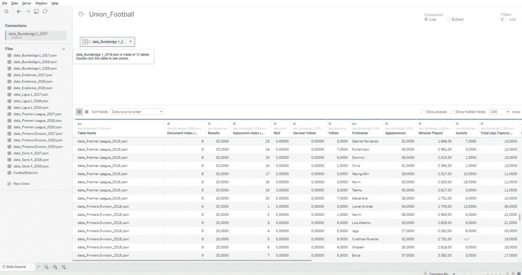
Finally, since multiple JSON files were obtained from the previous step, it was necessary to put them together through a union, to have only one data source in Tableau.
Below are the steps needed to create the Pareto chart in Tableau.
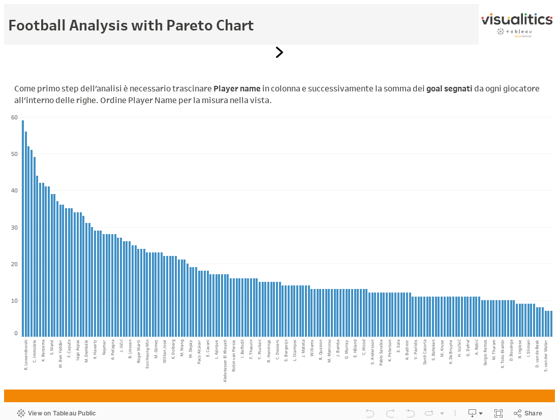
Looking at the visualization created at this point, we can highlight how 20% of the players managed exclusively within the 2017 and 2018 seasons to score a total of 35/40% of the goals. The distribution of goals within the top-scorers of the major soccer leagues is evidently much less concentrated than what we might have expected and what the assumption of the Pareto analysis states.
To learn more about the world of Business Intelligence, visit the official Tableau page, keep following us on our blog and on our social channels Facebook and LinkedIn.