A funnel chart is generally used to visualize how data moves through a process. The chart takes its name from its shape, which starts from a broad head and ends in a narrow neck.
Let us then see how to build step-by-step funnel chart on Tableau. Our goal is to create a graph showing sales per product sub-category from Sample Superstore data.
Step 1. Create the chart
- Connect to the data source Sample – Superstore.
- Drag Sales to Columns.
- Drag Sub-category to Rows.
- Click in the toolbar on the icon for descending order (see guide Funnel Chart part one if you can’t find it).
- In the Rows space, type -sum ([Sales]). Tableau will create a new tab in the Rows space. Drag it before SUM (Sales). You should get this.
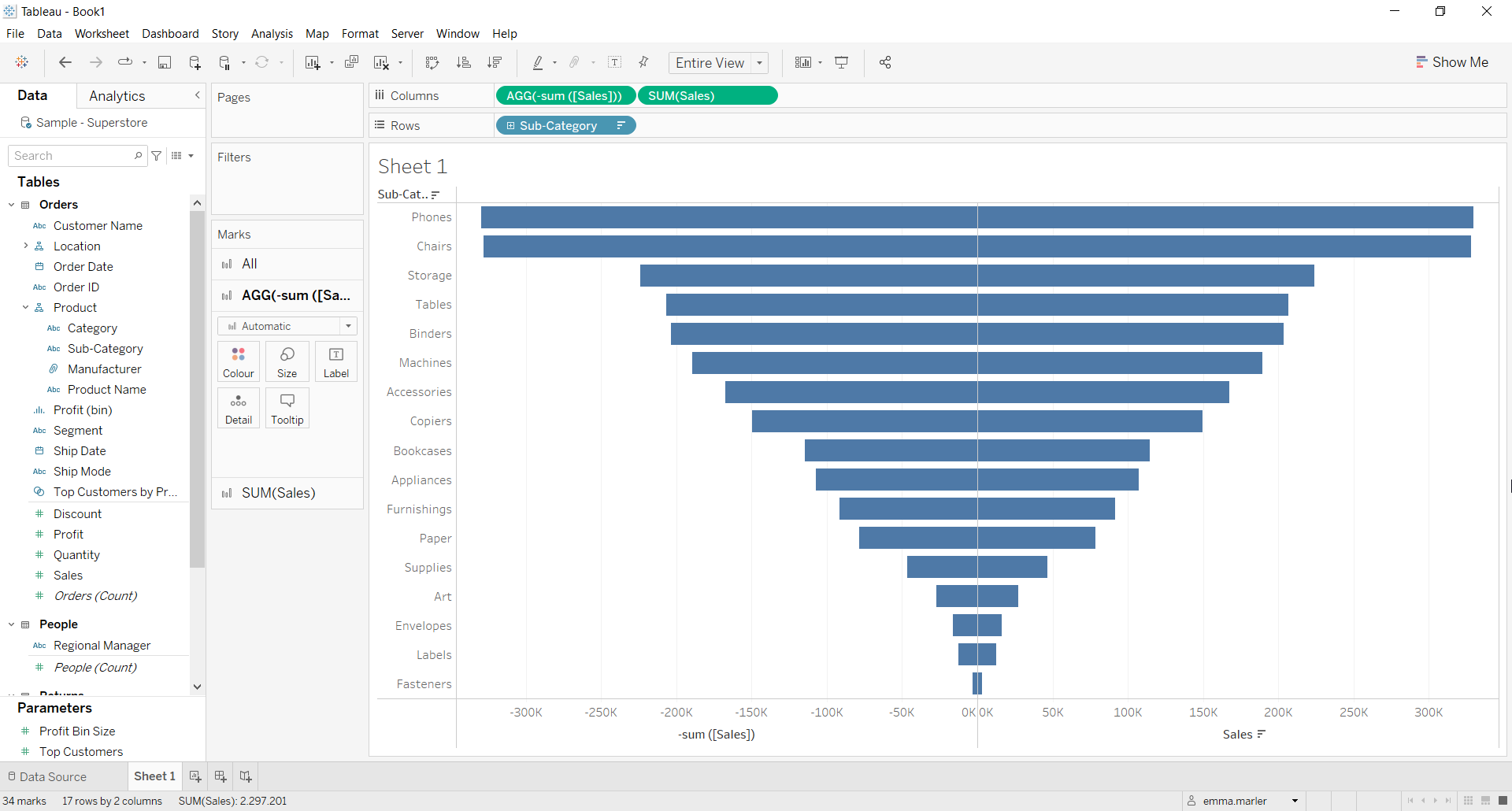
- From the dropdown menu in the Marks card called All select Area. Fit to Entire view if you haven’t done so already.
- Select the Marks card called AGG(-sum ([Sales]). Drag Sub category on Label in that Marks card.
- Select the Marks card called SUM (Sales). Drag Sales on Label.

- Click on Label in both Marks card and select Left alignment for Subcategory and Right Alignment for the Sales values.
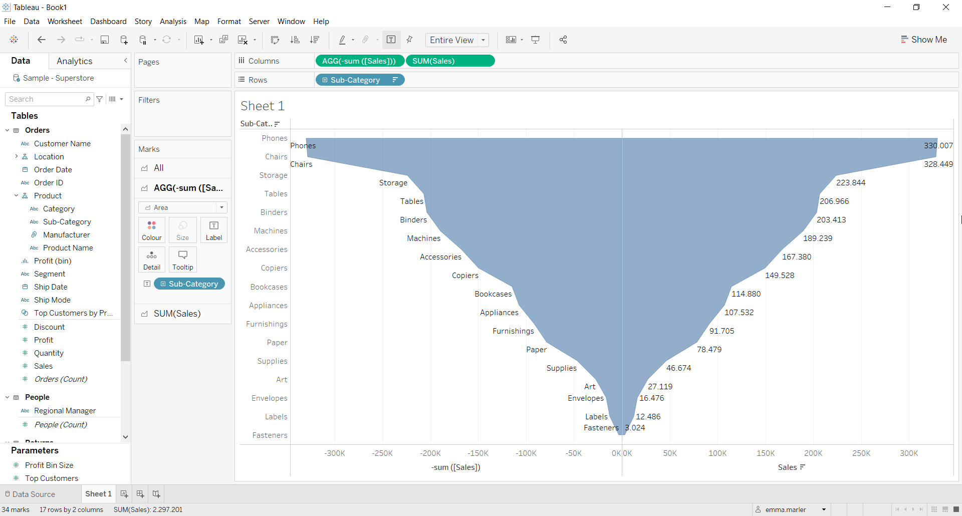
- Right Click on Sub category in Rows and untick Show header.
- Right click on the x-axis and untick Show header.

Don’t wait! Contact us to learn more and continue to follow upcoming news on our website and LinkedIn channel.