


Candlestick charts are often used in finance to analyse price movements over time. Let us then see how to build step-by-step progress a candlestick chart on Tableau.
Step 1. Create the candlestick chart
- Connect to the data source (in this case we are not using Sample Superstore).
- Right click on Date in the data pane. Select Change data type > Date.
- Drag Date on Columns by right clicking on it in the meantime. Select MDY (Date) in blue.
- Drag Date on Filters. Select Month/Year in blue and select All.
- Drag High on Rows.
- Drag Low on the y axis until you see two green rectangles appear and drop.
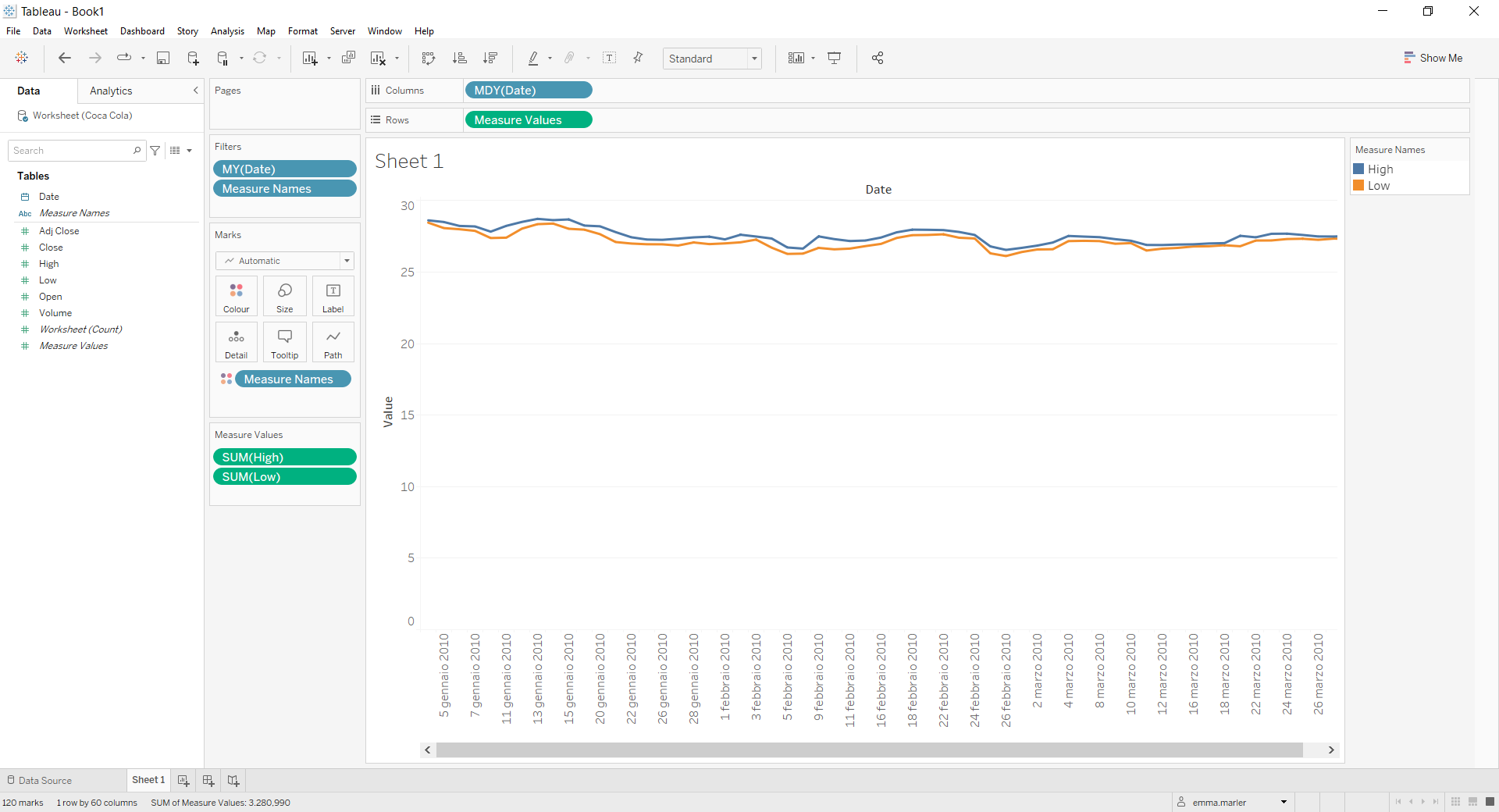
- Drag Measure Names off the Marks card.
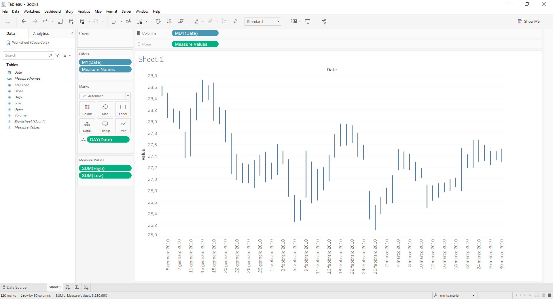
- Drag Date on Detail in the Marks card. Right click on it and select Day May 8 2015.
- Right click on the y axis and select Edit axis. Untick Include zero.
- Create a calculated field. Let’s call it “Up or down” and type if avg ([Close])>AVG([Open])then “up” ELSE “down” END .
- Drag Up or down on Color in the Marks card. Select blue for “down” and red for “up”.
- Create another calculated field. Let’s call it “Closed up” and type if avg ([Close])>AVG([Open])then avg ([Close]) END .
- Create another calculated field. Let’s call it “Closed down” and type if avg ([Open])>AVG([Close]) then avg([Open]) END .
- Drag Open and Close on Detail in the Marks card. Right click on each of them and select Measure (Sum) > Average.
- Drag the calculated fields Closed down and Closed up on Detail in the Marks card.
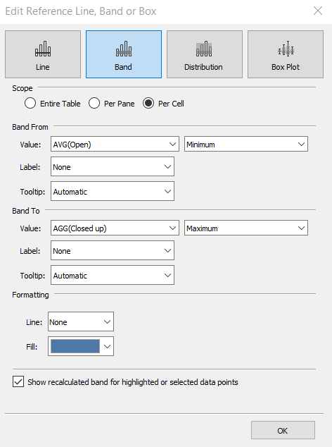
- Click on the Analytics pane on the left. Drag Reference Band and drop it on Cell. Fill out the window as shown below.

- Drag Reference Band and drop it on Cell again. Fill out the window as shown below.
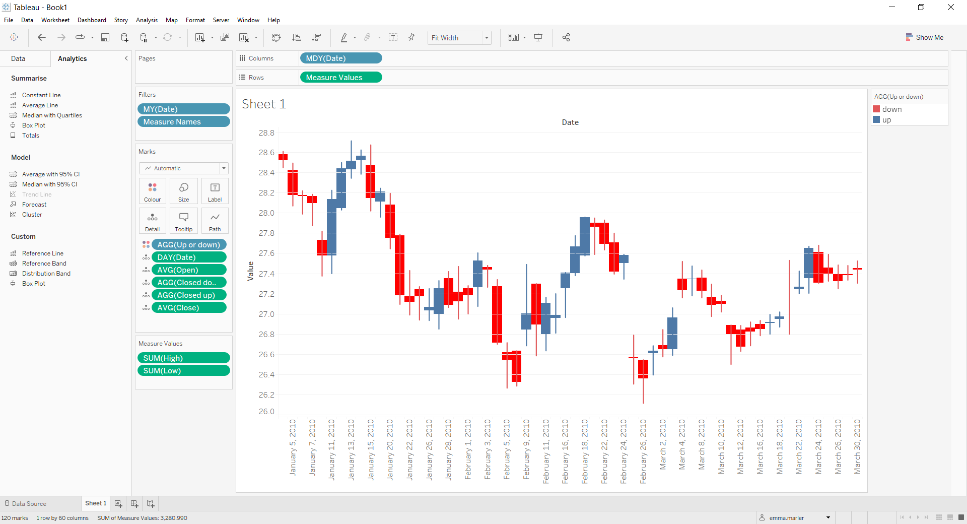
- Done!
Don’t wait! Contact us to learn more and continue to follow upcoming news on our website and LinkedIn channel.