Logo Visualitics - Esperti di Data Analysis
Tableau

How to create a Marimekko chart in Tableau

In this article, we will explain how to create a Marimekko chart in Tableau. This chart helps to better understand categorical data by showing how categories and subcategories relate to each other. You will see how it can be useful in various sectors, and we will demonstrate, with a practical example, how to create one.

What is a Marimekko chart and when is it used?

A Marimekko chart, or Mekko chart, is a type of chart that uses stacked bars to represent categorical data. This chart is distinguished by its ability to provide a clear and immediate representation of the sizes and relationships between categories and subcategories, thanks to the presence of two axes that define the height and width of the bars.

Its utility extends across various fields:

  1. Sales Data: It allows the analysis of sales trends and understanding, for example, which store achieved the highest sales.

  2. Market Segmentations: It facilitates the interpretation of how different market segments or consumer groups are structured, highlighting their sizes and characteristics.

  3. Survey Results: It shows how responses to a survey are distributed among different groups of participants, offering a detailed overview of various opinions and trends.

  4. Hierarchical Data Visualization: It is suitable for representing data structured in a hierarchical form, allowing the visualization of how proportions are distributed within different levels or categories.

How to construct a Marimekko chart in Tableau

To bring our Marimekko chart to life, the first step is to connect to the Superstore data set, which Tableau makes available to all users.

Once the connection with the Orders table is established, we can begin constructing our chart.

First, we need to drag the “Region” and “Category” fields into detail and “Sales” into text.

Next, right-click on the “Sum(Sales)” field and select “Add a Table Calculation.” Here, under “Calculation Type,” choose “Percent of Total” and make sure to select “Category” as the Specific Dimension.

Add a Table Calculation

We continue by creating the calculated field “Regional Sales” using the formula {FIXED [Region]: SUM([Sales])}. This step allows us to establish a more detailed analysis by region.

The next step involves creating another calculated field, “Running Region Total,” which we will place in the Columns section with the following formula:

				
					IF FIRST () = 0 THEN MIN([Regional sales])
ELSEIF MIN([Region]) != LOOKUP(MIN([Region]),-1) THEN PREVIOUS_VALUE(0) + MIN([Regional sales])
ELSE PREVIOUS_VALUE(0)
END


Creating Calculated Fields "Running Region Total"

Then, we insert the “Measure Names” field into the filter and select “Sales” and “Regional Sales.” Next, we add “Measure Values” into detail.

"Measure Names" fields in filter

We move the “Sum(Sales),” to which we have applied the table calculation, into Rows and change the “Mark Type” to “Bars.” By right-clicking on the field in Columns, we select “Compute Using” and then “Region.”

Select "Region"

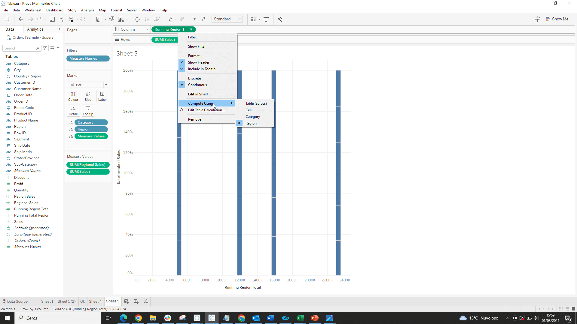
We drag “Regional Sales” from “Measure Values” to “Size” and click on “Fixed” and “Alignment Right” in “Size.”

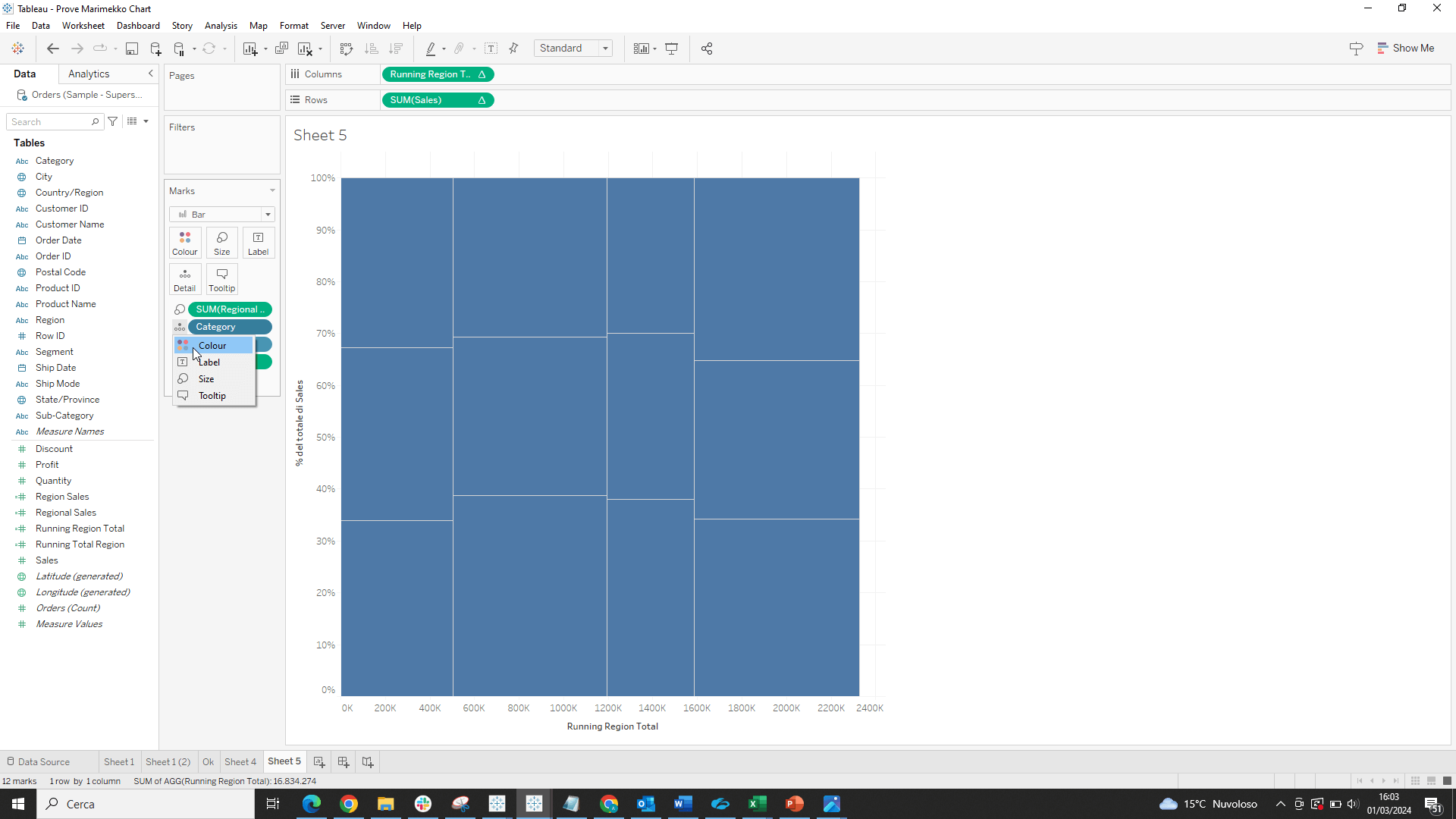
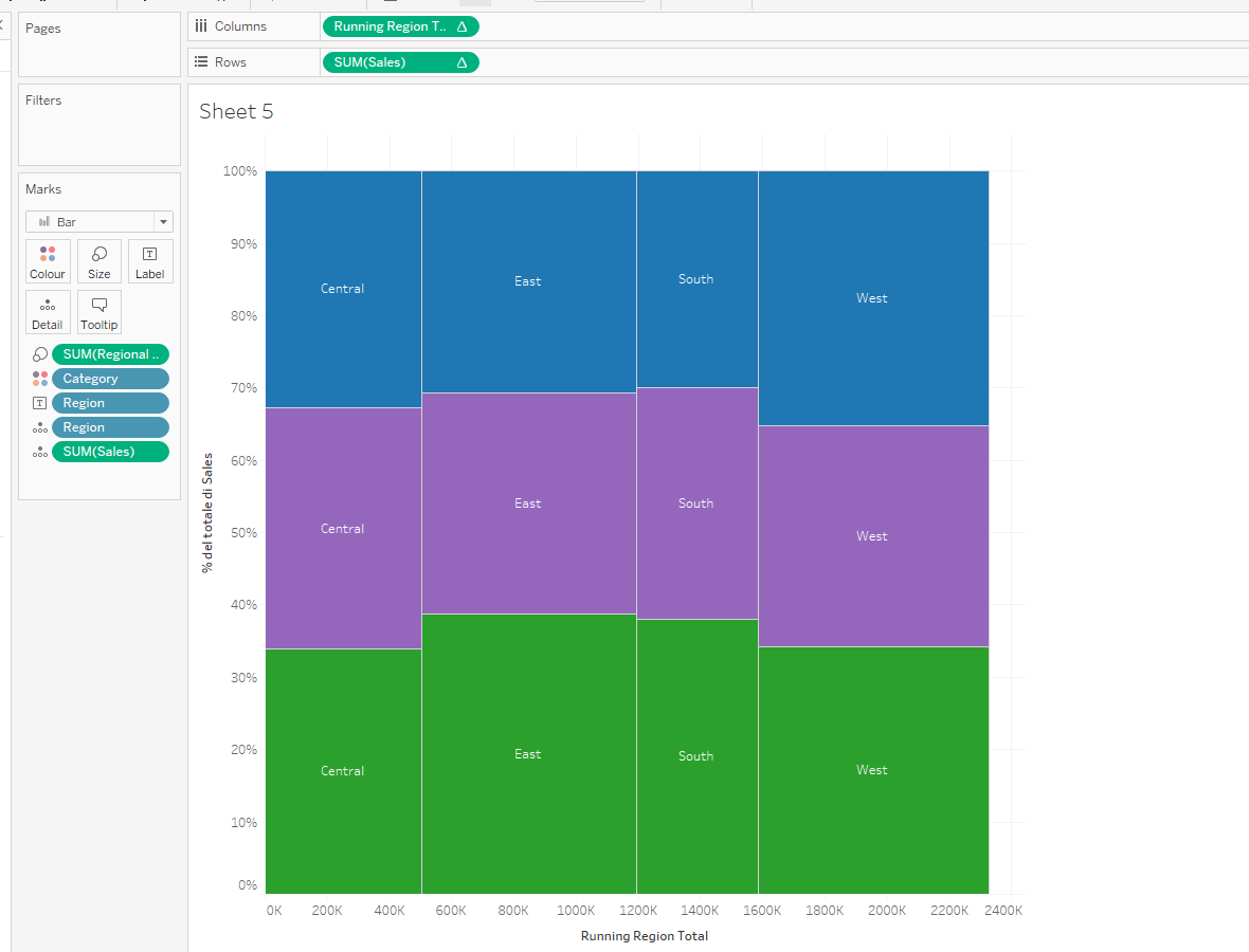
With these steps, we have established a solid foundation for our Marimekko chart. Now, to make it even more functional, we insert labels and colors by moving the “Category” field from “Detail” to “Color.”

Add labels and colors

Finally, to complete our visualization, we insert the “Region” field into “Text,” thus enriching the chart with relevant textual information.

grafico marimekko tableau
Add textual information

Conclusions

In conclusion, the Marimekko chart is an extremely effective graphical tool for analyzing and visualizing categorical data, offering a clear view of the relationships between categories and subcategories. Its applicability in various contexts makes it a valuable tool for any analyst or professional wishing to communicate complex data in an intuitive and impactful way.

Read all our articles on Tableau

Do you want to discover the latest features or delve into certain functions to become an expert?

Visualitics Team
This article was written and edited by one of our consultants.

Share now on your social channels or via email: