


A bar chart is perfect for visualizing your data according to different categories or subgroups. To construct a bar graph, one variable must be quantitative and the other qualitative.
Let us then see how to build step-by-step rounded bar graph on Tableau. Our goal is to create a graph showing sales for each category and sub-category from Sample Superstore data.
Step 1. Create the chart
- Connect to the data source Sample – Superstore.
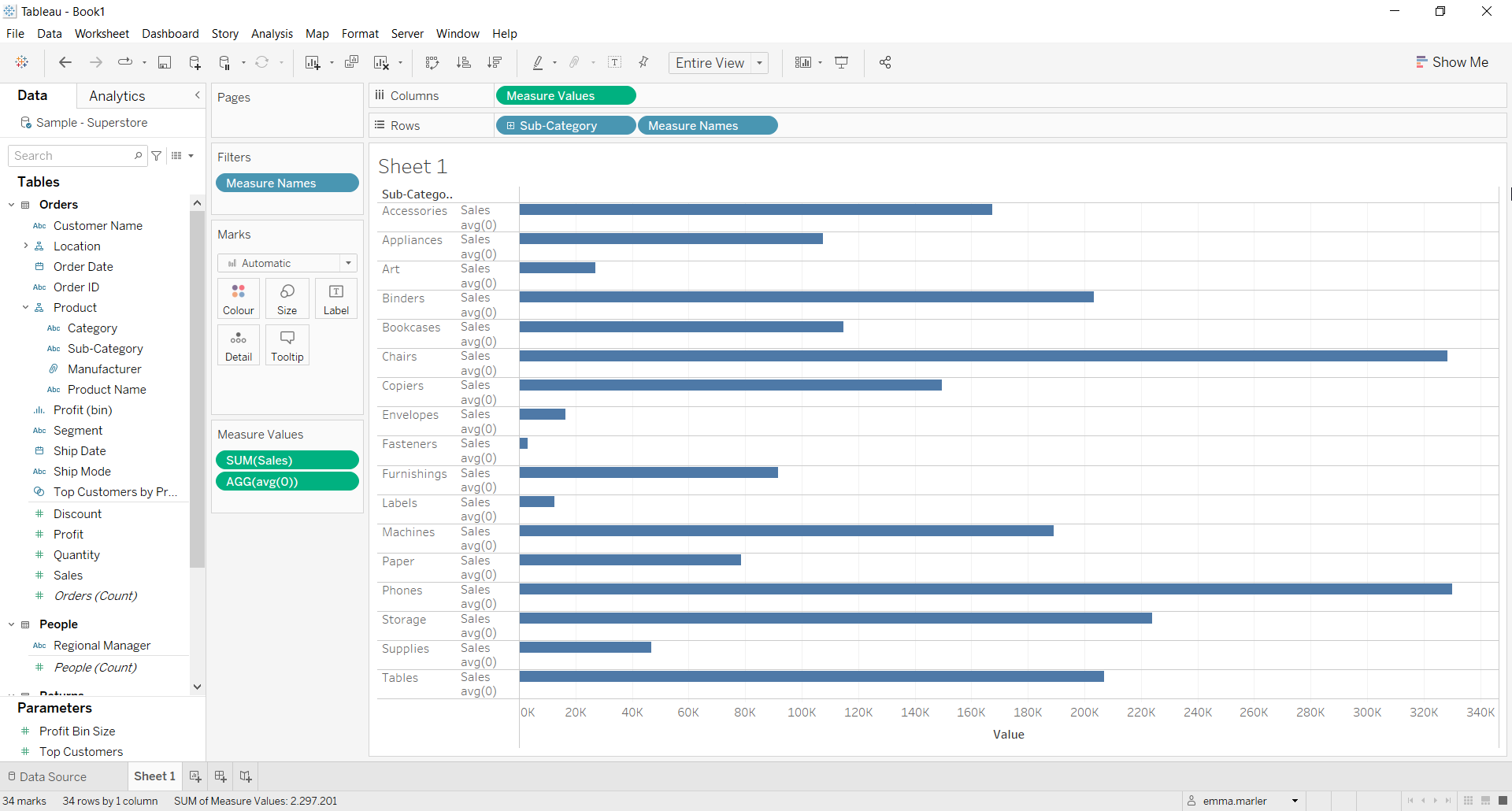
- Drag Sub-Category to Rows.
- Drag Sales to Columns. You will get a standard bar chart.
- Type in the Columns avg(0). Then drag that tab on the x axis labeled Sales. Fit to Entire view and this is how your screen should look like at this point.
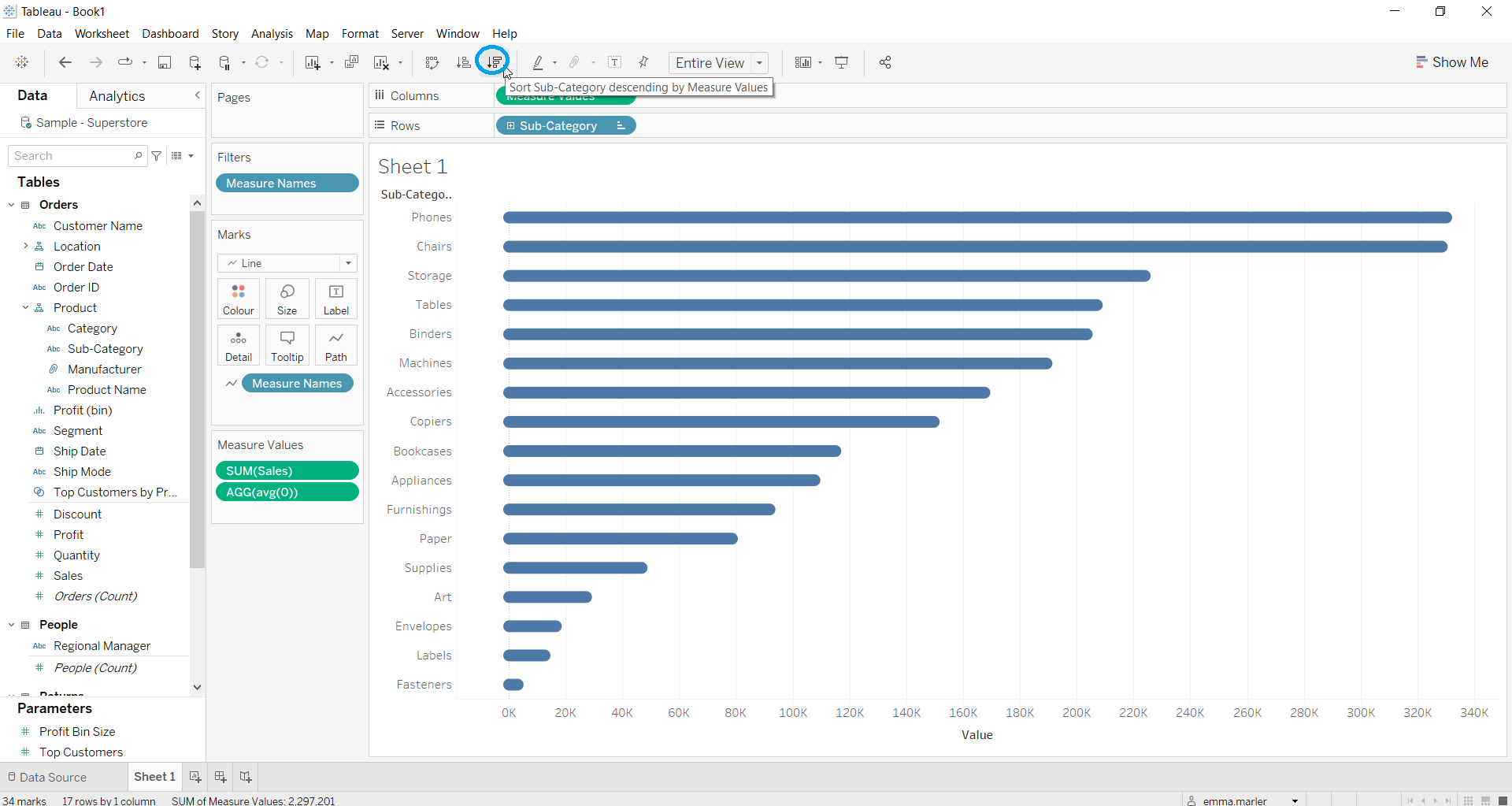
- Select Line from the dropdown menu in the Marks card.
- Drag Measure Names on Path in the Marks card.
- Adjust the size of the bars from Size in the Marks card.
- Click on the icon to apply a descending order as shown below.
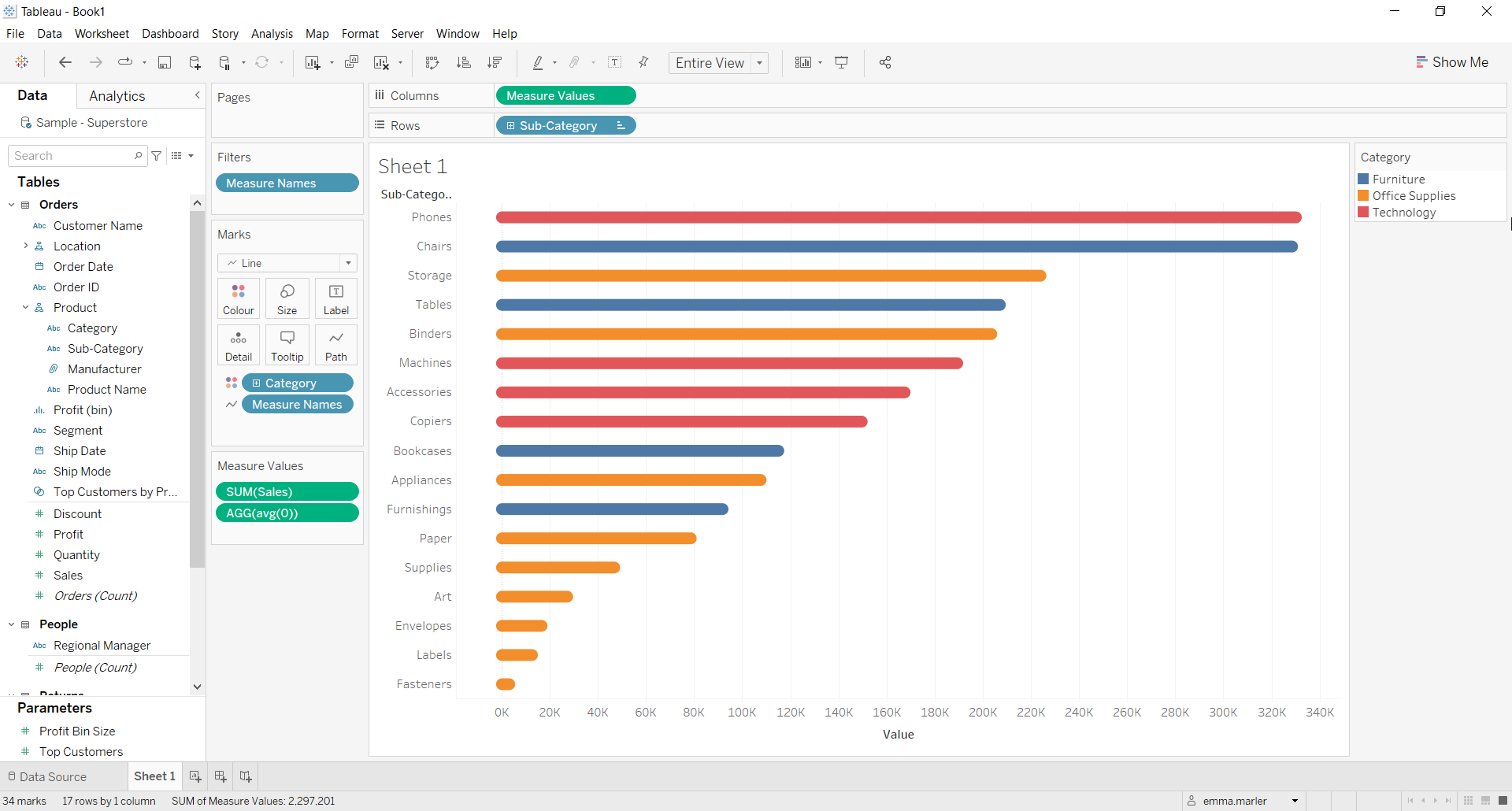
- Drag Category on Color in the Marks card. Done!
Don’t wait! Contact us to learn more and continue to follow upcoming news on our website and LinkedIn channel.