


A pie chart is a circle divided into slices. Each slice is usually represented with a percentage or in absolute value to express a part-to-whole relationship between variables. Pie charts can be used with categorical or nominal data, while it does not make sense if your data is continuous.
It’s a good graph to convey the general sense of the part-to-whole relationship in your data and comparing the precise sizes of the slices is less important. If you want to highlight how one variable is over represented in your data then using a pie chart would be a good idea, because it would immediately convey to the audience that there is one slice is cleary predominant. On the other hand, if there are too many slices of small size then a pie chart might end up being confusing.
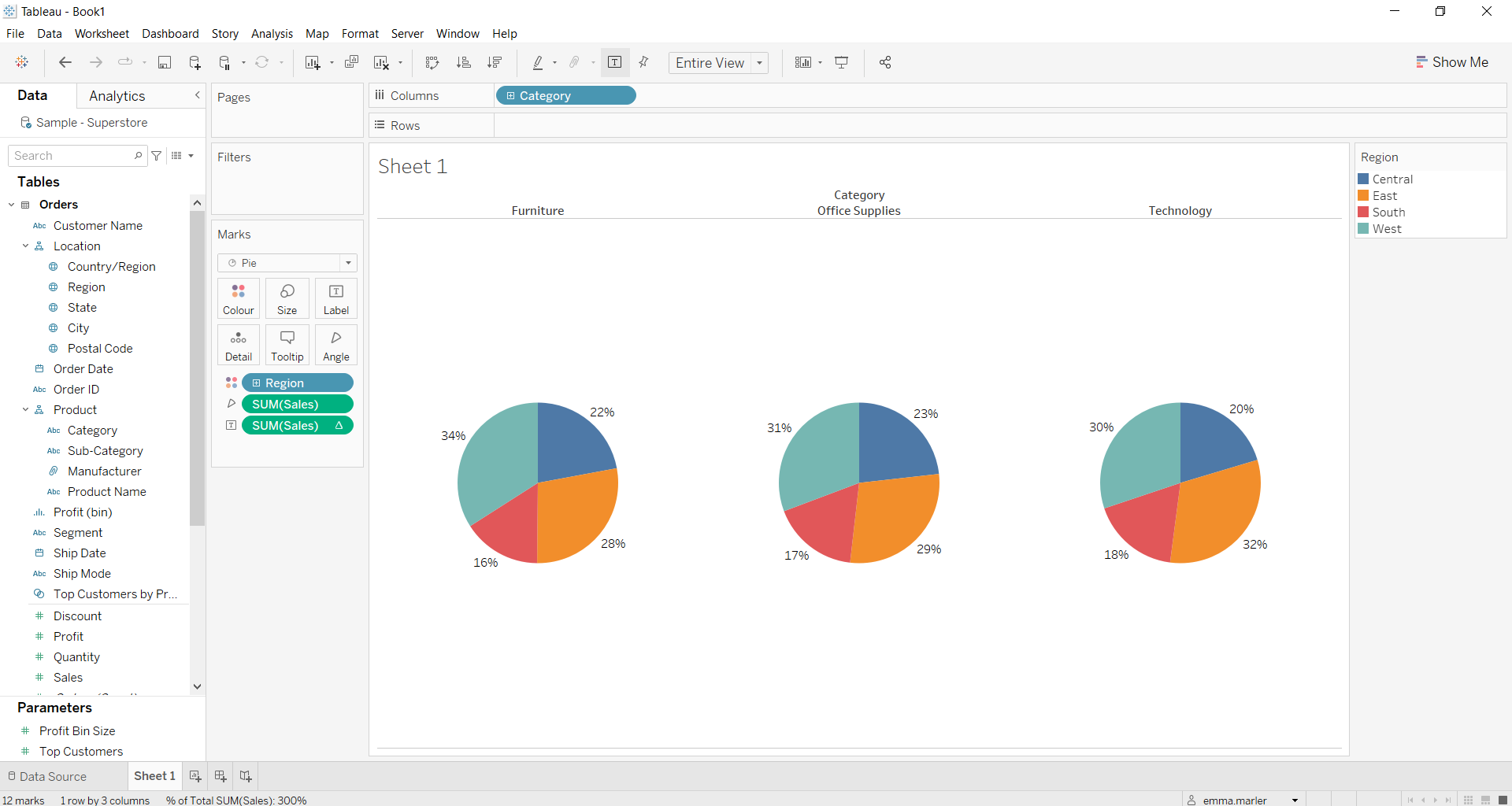
We can use multiple pie charts stacked one next to the other to compare more information and show proportional parts of multiple wholes. Let’s see then how to build multiple pie charts on Tableau step-by-step. Our goal is to create three pie charts showing the percentage of total sales across regions in each of the three product sub-categories offered by the Sample Superstore data.
Step 1: Create multiple Pie Charts
- Connect to the data source Sample – Superstore.
- Select Pie from the dropdown menu in the Marks card.
- Drag Sales and drop it on Angle in the Marks card.
- Drag Category (under Product) an drop it on Columns.
- Drag Region (under Lacation) on Color in the Marks card.
- Fit to Entire View in the toolbar. Now you’ll have three pie charts!

Step 2: Add more details
- Drag Sales onto Label in the Marks card to have information on sales displayed on the pie chart.
- Right click on Sales in the Marks card, select Quick Table Calculation and then Percent of total. Right click on Sales in the Marks card again, select Edit Table calculation, click on Specific dimensions and untick Category. This way you’ll have the percentages of sales per region in each of the three categories in this case.

- Right click on Sales in the Marks card again. Under the Default section, in Pane select Percentage in the ‘Number’ dropdown menu and reduce the decimal places to 0 if you want round numbers. Done!

Don’t wait! Contact us to learn more and continue to follow upcoming news on our website and LinkedIn channel.