Data Visualization at your fingertips: its use in mobile applications
How often do we handle our smartphones and interact with a chart displaying data without even realizing it? Data visualization in mobile applications has seen a significant surge in popularity, featuring a wide variety of apps that reflect the evolving needs of users in today’s digital age. As smartphones become ever-present tools for managing various aspects of life—from fitness tracking to financial management and learning—apps play a crucial role in enabling users to achieve their goals. By employing visual representations like graphs and diagrams, these apps transform complex data into accessible insights, allowing users to make informed decisions and embark on paths of self-improvement. With ongoing technological advancements, data visualization remains at the forefront, transforming how users interact with and derive value from their digital experiences.
Fitness & Health
In the field of fitness and health, mobile apps are extremely useful tools for users who aspire to lead a healthier lifestyle. These apps employ sophisticated data visualization techniques to help users track their fitness progress, monitor various health parameters, and ultimately achieve their wellness goals. Through the use of intuitive visual representations such as line charts, pie charts, and interactive maps, users can easily understand metrics like activity duration, distance covered, calorie intake, and heart rate variability. These visual cues not only provide valuable insights into users’ health and fitness journeys but also act as powerful motivators, encouraging users to stay committed to their goals.
Gantt Chart
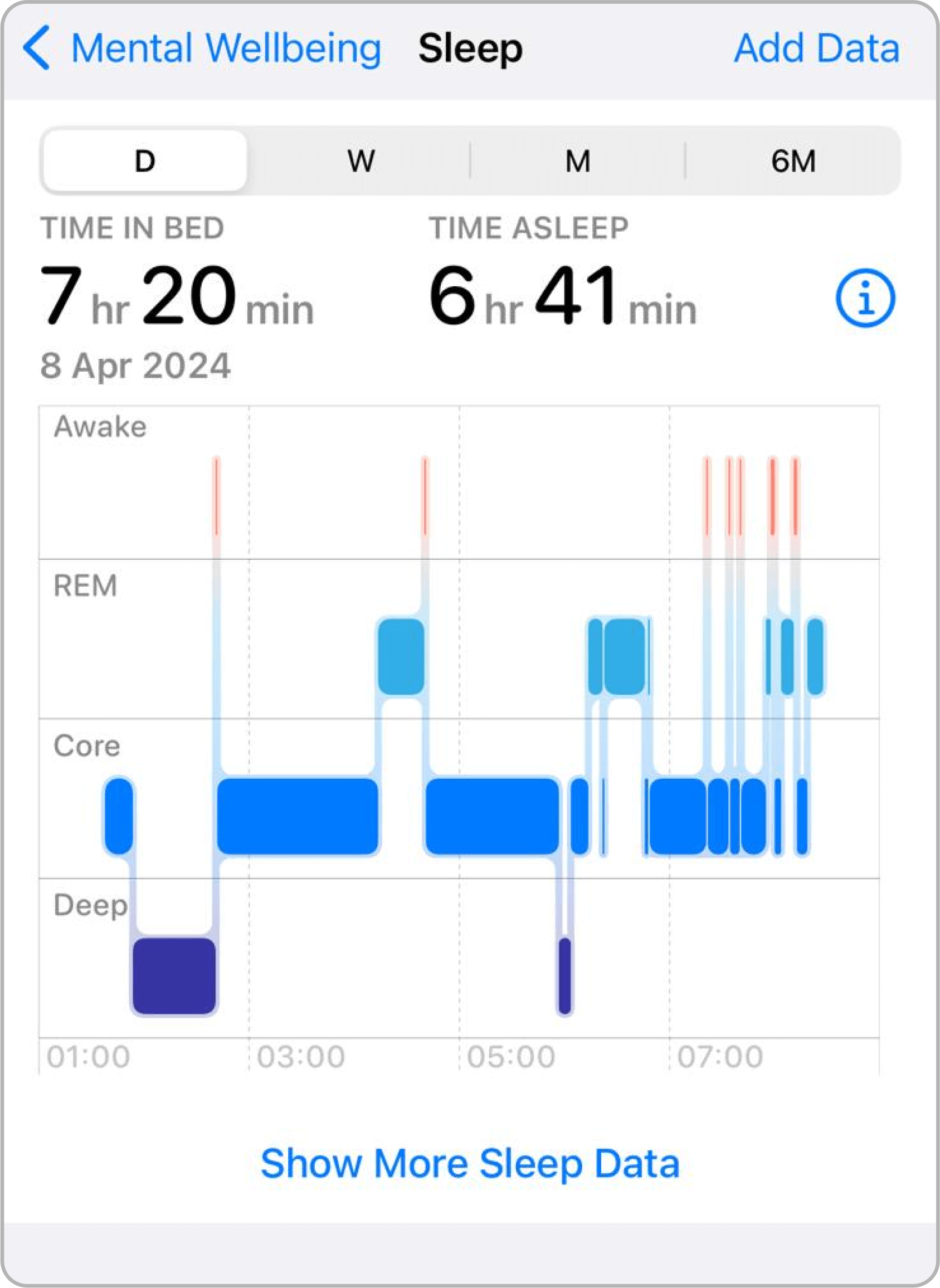
Apple Health
Each horizontal bar represents a different category or stage of sleep. The length of the bar indicates the duration of that particular sleep stage within the recorded time frame.
Color Coding: Different colors are used to distinguish between the various stages of sleep. For instance, in many sleep tracking apps, deep sleep might be indicated by a dark blue or purple, REM sleep by a lighter blue, light sleep by an even lighter blue, and periods of being awake by red or pink.
Time Axis: The horizontal axis across the bottom of the chart represents the time of night.
This visualization provides a comprehensive view of the user’s sleep architecture, which is important for understanding overall sleep quality and identifying any potential issues.
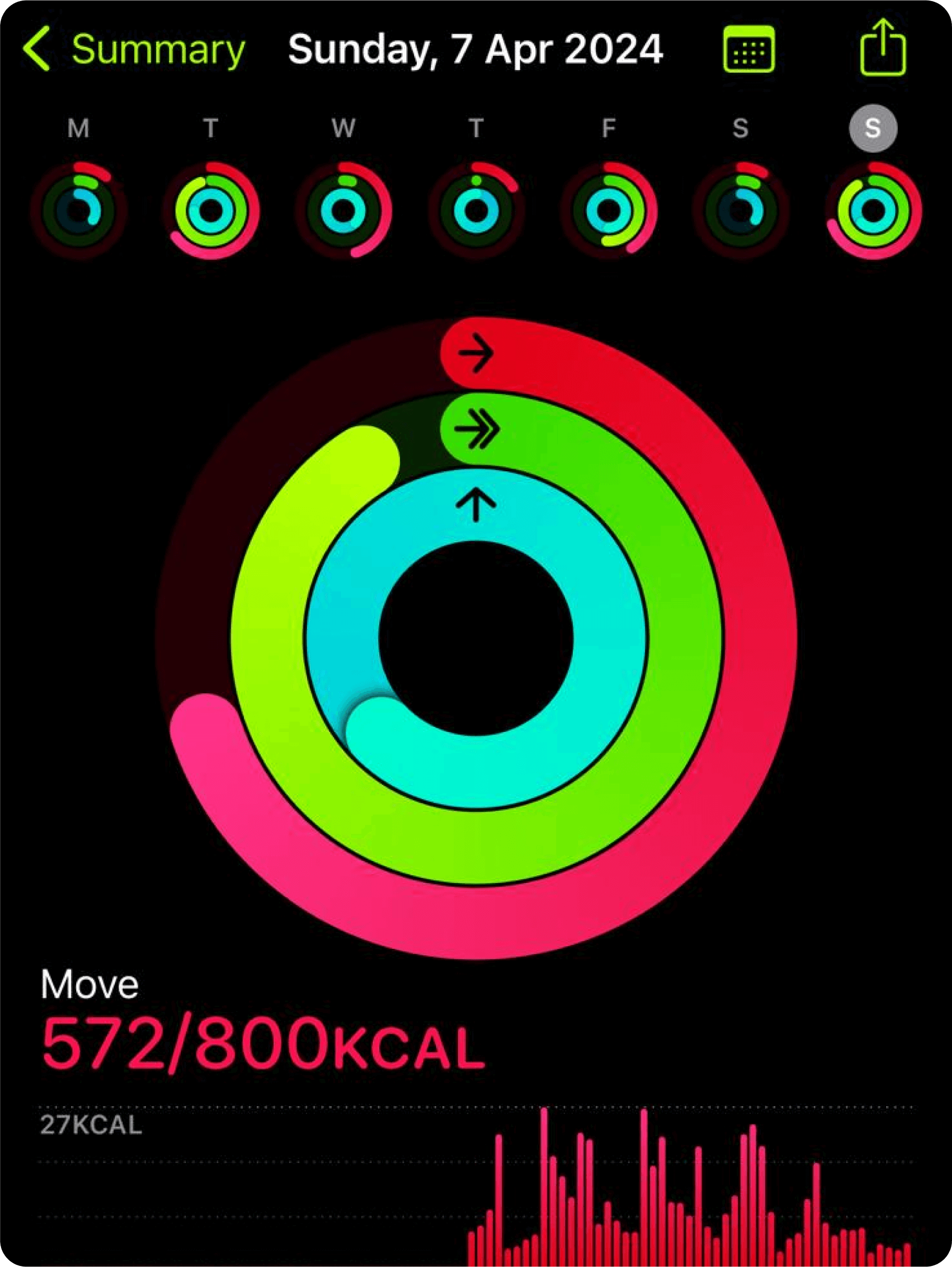
Radial Bar Chart
Apple Fitness
Progress Indication: The chart displays the user’s progress toward daily goals. As the user performs activities, the colored rings fill up, completing a 360-degree circle when the user meets the goal set for that activity.
Weekly Review: Users can see last 7 days’ radial charts to have a quick glance of their weekly progress
Activity Metrics: Each ring in the chart is assigned a unique color and represents a distinct aspect of physical activity:
The outermost ring (usually red) monitors the active calories burned (“Move”).
The middle ring (often green) reflects the minutes of brisk activity or intentional exercise (“Exercise”).
The innermost ring (commonly blue) tracks how often the user stands and moves for at least a minute within an hour (“Stand”).
The simplicity of the design makes it intuitive—users can quickly gauge how close they are to achieving their daily targets. The visual closure of each ring offers a satisfying indicator of completion.
Example 1
Example 2
Finance & Banking Management
Effectively managing personal finances can often seem like a daunting task, but mobile applications have revolutionized the way users approach this aspect of their lives. Through the smart use of data visualization, these apps provide users with a comprehensive overview of their spending habits, transaction trends, and budget allocations. Colorful charts and interactive dashboards offer valuable insights into the state of their finances, enabling users to identify areas for improvement and make informed decisions about their money management strategies. By presenting complex financial data in a visually appealing and easily understandable way, these apps empower users to take control of their financial situation with confidence.
Donut Chart
Revolut
The total spending amount is displayed in the center.
This is a donut chart that represents spending by category over a given period.
Each segment is color-coded to represent a category, such as food, shopping, or travel, and the arc length of each segment indicates the proportion of total spending in that category.
This visualization helps users quickly understand where their money is going and which categories are the largest portions of their spending.
Line Chart
Spendee
The dotted line represents the projected spending. While the solid line shows the actual spending, which changes color depending of the difference between projected spending.
Additional information like daily budget advice and a comparison with previous periods helps users manage their finances by offering insights into spending patterns and providing benchmarks for improvement.
Si tratta di un grafico a linee che traccia la spesa nel tempo.
Example 1
Example 2
Education & Learning
Mobile applications dedicated to education and skill development have become essential tools for students of all ages. Data visualization plays a crucial role in enhancing the learning experience by providing users with visual representations of their progress and achievements. In the context of the so-called “gamification” of learning, visualizations that track progress, rewards for surpassing various levels, and interactive charts not only help users visualize their learning path but also act as powerful motivators to stay on track and pursue continuous improvement. By leveraging data visualization techniques, educational apps enable users to monitor their performance, set goals, and remain engaged in their journey of knowledge.
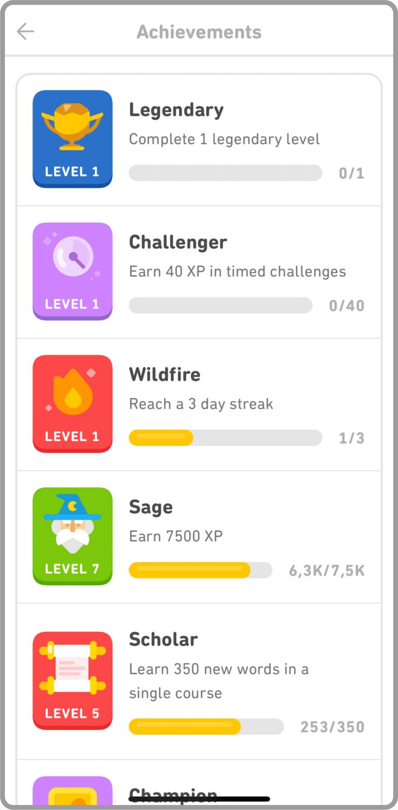
Progress Bar Chart
Duolingo
This type of visual reward system encourages continued engagement in the app’s activities by recognizing user progress.
Each badge has a progress bar and shows the level achieved, with some indication of what is required to reach the next level.
Here, we have a series of badges that represent achievements or milestones.
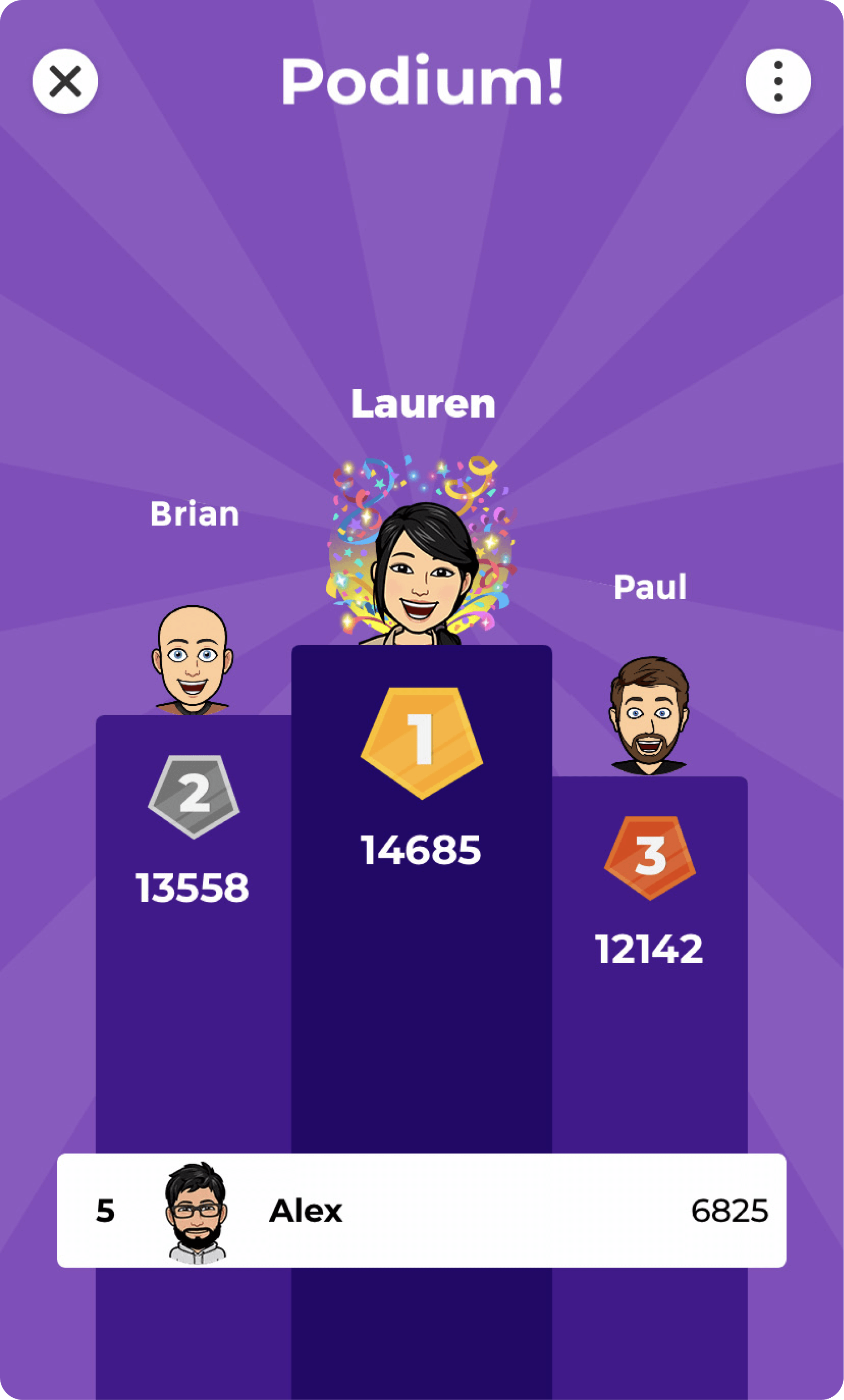
Podio
Kahoot
This is a playful, gamified representation of ranking, showing avatars of participants on a podium according to their scores.
It’s designed to foster competition and engagement within a group by visually highlighting performance in a fun and interactive way.
Example 1
Example 2
Weather Forecasts
Mobile weather apps have transformed how users access and interpret weather forecasts, thanks to their innovative use of data visualization techniques. These apps utilize interactive maps, radar images, temperature charts, and hourly forecasts to present users with accurate and easily understandable weather information. By displaying weather patterns and forecasts in a clear and intuitive manner, these apps enable people to plan their activities accordingly and stay prepared for whatever Mother Nature has in store. Whether it’s tracking storms, monitoring temperature fluctuations, or planning outdoor activities, weather apps with data visualization capabilities allow users to make informed decisions and stay one step ahead of potential precipitation.
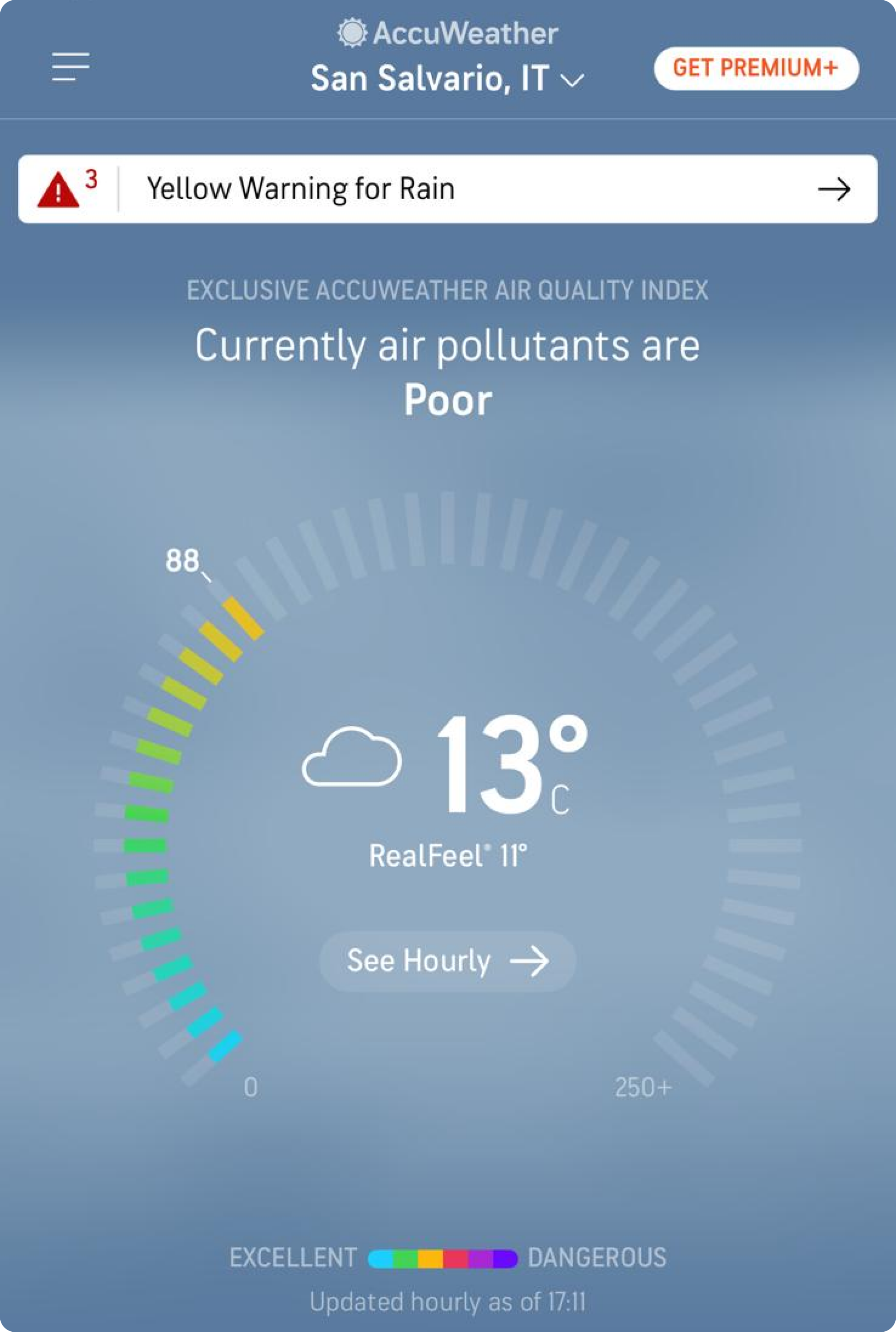
Radial Gauge Chart
AccuWeather
The needle points to the current AQI level, providing a quick visual indication of air quality.
The gauge is color-coded from green to red, indicating the quality from good to hazardous.
This chart is a radial gauge that displays the current Air Quality Index (AQI). This real-time information is critical for health and outdoor activity planning, especially for individuals with respiratory concerns.
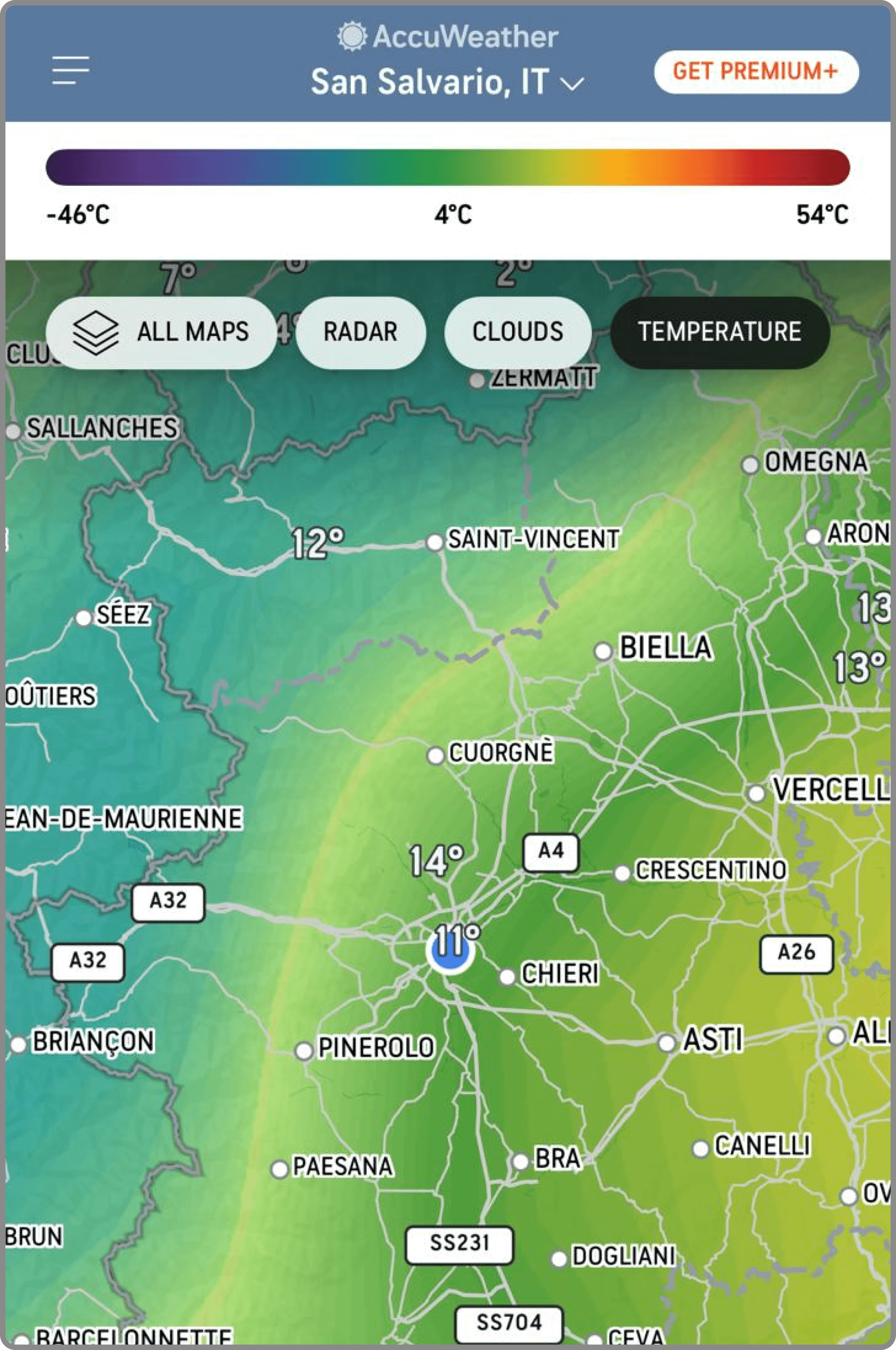
Geospatial Temperature Map
AccuWeather
On the top it provides a clear legend to understand color coding in a better way
A color-coded temperature map that uses shades to indicate different temperatures across geographic locations.
Users can see at a glance which areas are warmer or cooler, useful for understanding broad weather patterns and for planning travel or outdoor activities.
Example 1
Example 2
Conclusions
In conclusion, data visualization plays a fundamental role in enhancing user experience and facilitating informed decision-making across a wide range of mobile application categories. By presenting complex data in a visually appealing and accessible manner, data visualization enables users to achieve their goals, monitor their progress, and establish meaningful connections with their data. Whether it’s tracking fitness goals, managing finances, or staying informed about the weather, data visualization in mobile applications proves to be a powerful tool in empowering users to lead healthier, more productive, and fulfilling lives.
Explore our articles on Data Visualization
Curious about Data Viz? Explore the World through data.