


A panel chart is a perfect way to understand data that has several variables to be visualised by making individual smaller charts one next to the other, making them easy to compare. You can make panel charts with lines, bars, areas, etc.
Let us then see how to build step-by-step a panel line chart on Tableau. Our goal is to create a line graph for each region showing sales for each sales category from Sample Superstore data.
Step 1. Create a panel line chart
- Connect to the data source Sample – Superstore.
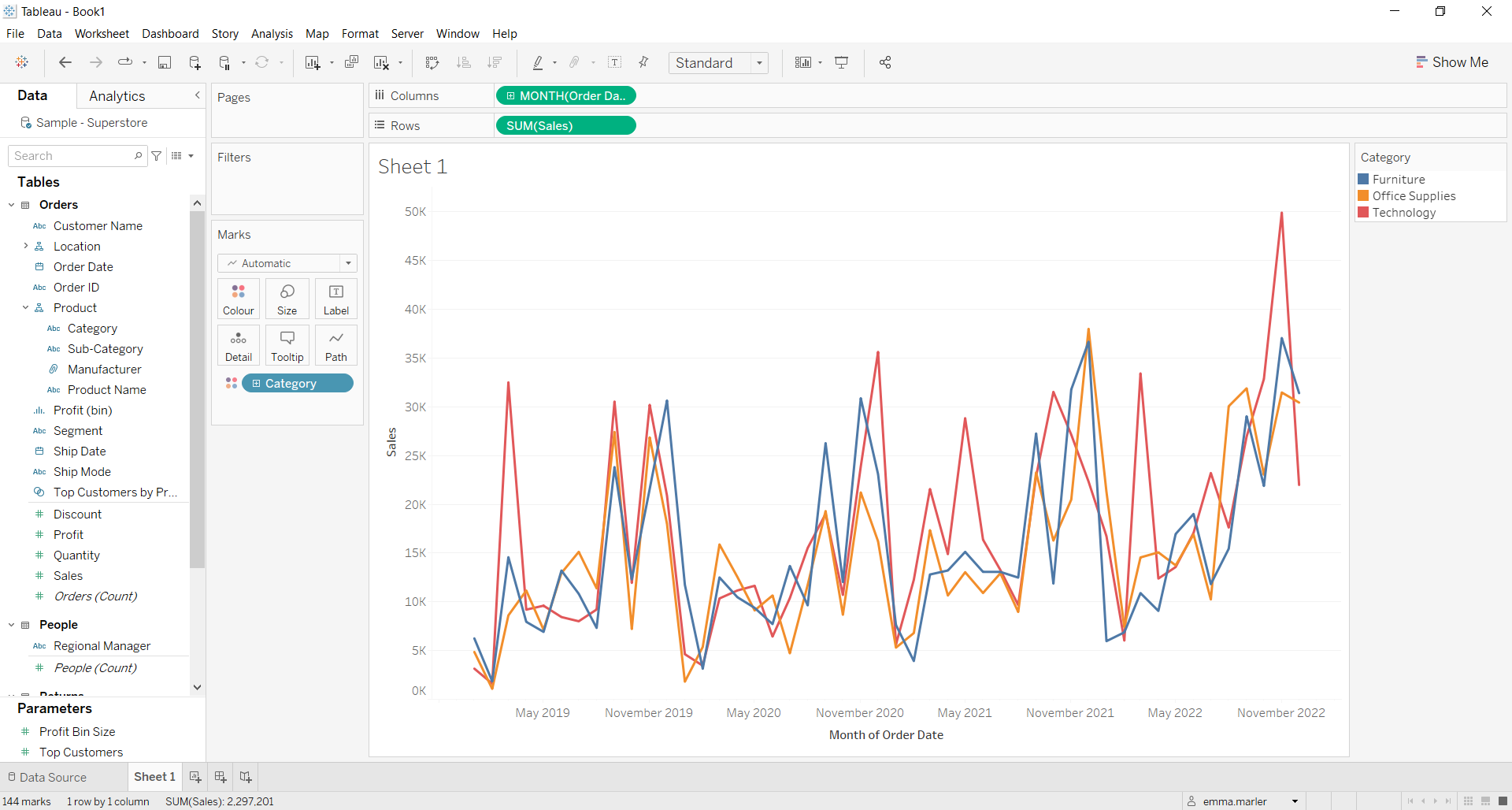
- Drag Order date (that can be found under Location) to the Columns. Click on it and select Month May 2015.
- Drag Category to Color on the Marks card.
- Drag Sales onto Rows. You will get multiple line charts in one quadrant.
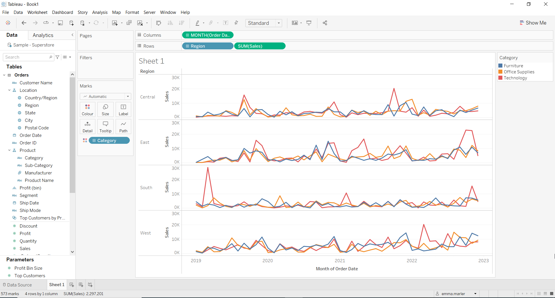
- Drag Region on Rows. There you go!
Don’t wait! Contact us to learn more and continue to follow upcoming news on our website and LinkedIn channel.