


A slope chart can be used to show a ‘before and after’ story of different values, based on comparing their values at different points in time. The related values are connected by slopes.
Let us then see how to build step-by-step a slope chart on Tableau. Our goal is to create a graph showing sales in 2019 and 2022 per sub-category from the Sample Superstore data source.
Step 1. Create a slope chart
- Connect to the data source (in this case we are not using Sample Superstore).
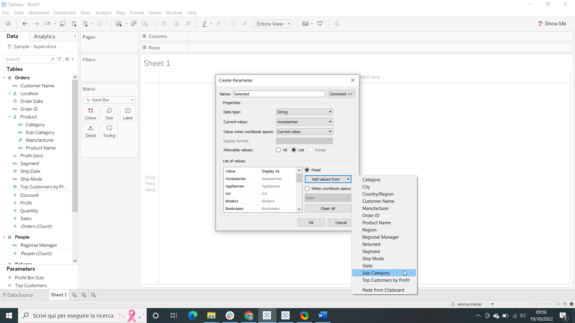
- Create a parameter and call it “Selected”. Fill out the window as shown in the picture below.
- Create a Calculated field. Let’s call it “Selected sub-category” and type [Sub-Category]=[Selected].
- Drag Order Date to Columns.
- Drag Order Date to Filters and select Years > tick 2019 and 2022. Fit to Entire view.
- Drag Sales on Rows.

- Drag Sales on Rows again. Right click on it and select Dual axis.
- Right click on the Sales axis on the right and select Synchronize axis.
- Click on the Marks card SUM (Sales) (2). Select Circle from the dropdown menu.
- Select the Marks card called All. Drag Selected sub-category on Color and Sub-category on Detail.
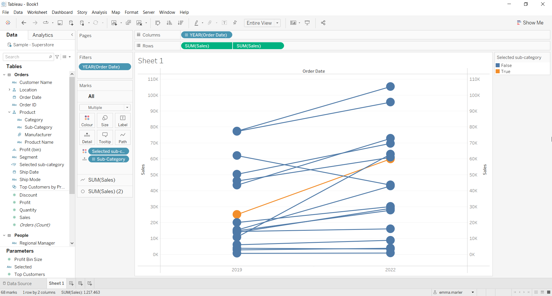
- Change the colors for True and False if you want.
- Right click on Selected sub category on the left pane. Select Default properties > Sort > Sorty by Manual > move True above False as in the picture below.

- Select the Marks card called SUM (Sales) (2). Drag Selected sub category on Size.
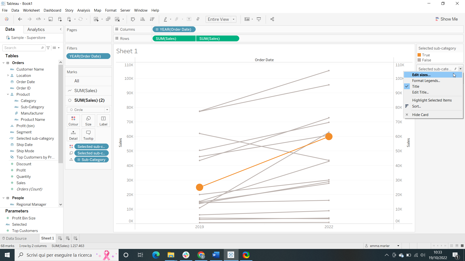
- On the top right corner next to the view, click to edit the sizes of sub categories as shown in the pictures below.

- This is what you should get!

Don’t wait! Contact us to learn more and continue to follow upcoming news on our website and LinkedIn channel.