


In this article, we will guide you through the creation of the stacked bar chart, the 100% stacked bar chart, and the stacked side-by-side bar chart, illustrating step by step how to create them in Tableau. The stacked bar chart is an immediate and effective visual representation that, starting from the classic bar chart, allows users to compare parts of a whole: each bar represents a whole that is divided based on an additional category.
What is a Stacked Bar Chart?
The stacked bar chart is an extension of the classic bar chart. This type of chart allows you to obtain information about an additional categorical variable within the bars themselves. As a result, you get a single chart in which you can see both the information on the individual bars and the breakdown of these bars by another categorical variable.
How to create it in Tableau
Let’s proceed step by step to create a stacked bar chart in Tableau. In the following example, starting from a bar chart, we will see how to break down sales by the additional category that represents the region in each product subcategory. We will use data from Sample Superstore.
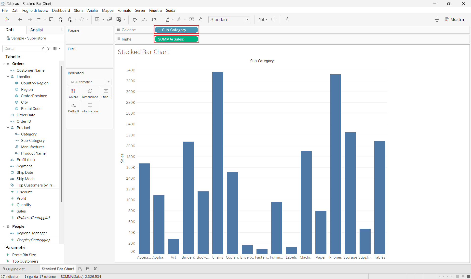
Step 1: Create a bar chart
- Connect to the Sample-Superstore data source, which you can find on the Home page.
- Drag the Sub-Category field to Columns and the Sales field to Rows. You will notice that Tableau will have created the Sum aggregation of the measure used by default.
At this point, you will have obtained the classic bar chart.
Step 2: Create a stacked bar chart
- To display the breakdowns by region of the individual bars, drag the Region field to the Color section of the Marks card.
- To better view the newly created chart, select Entire View from the dropdown list on the toolbar.
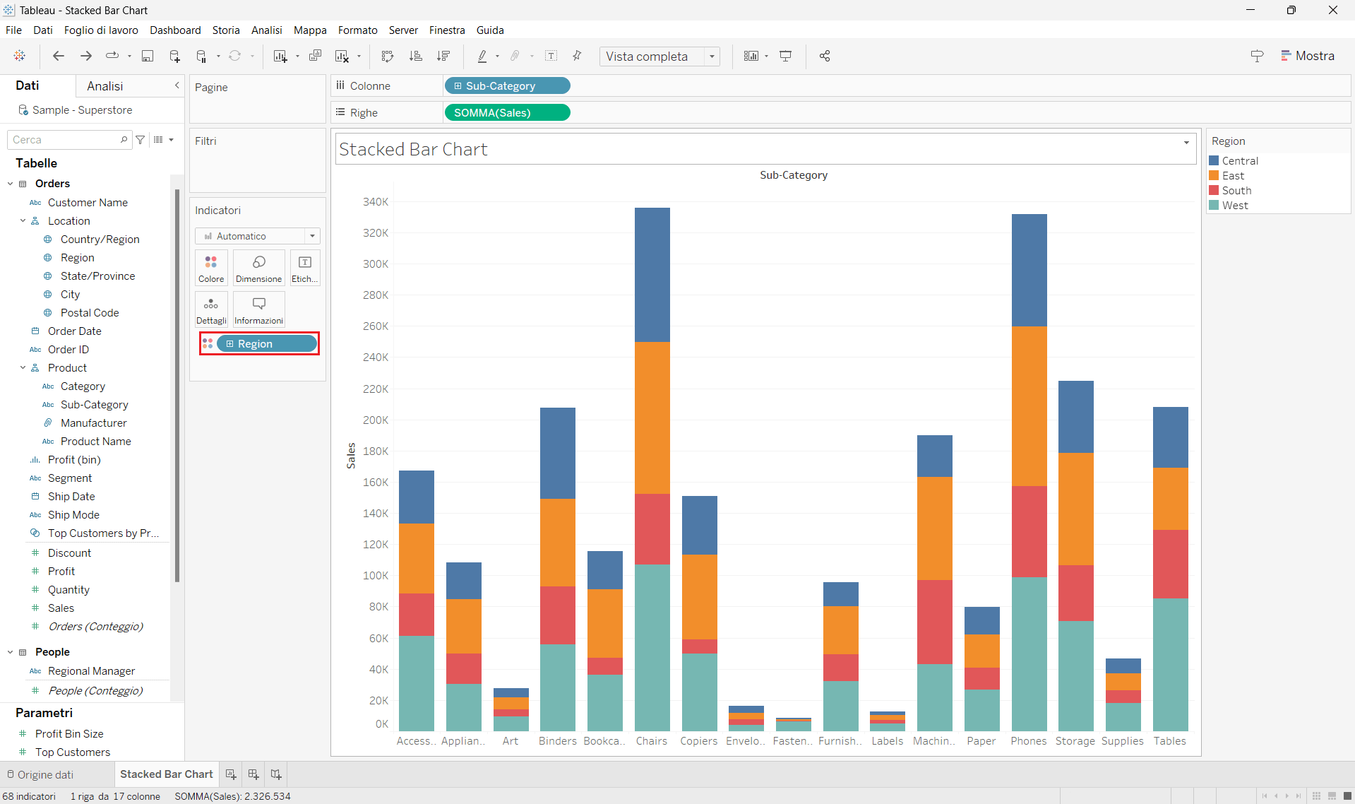
That’s it! You have created a stacked bar chart that you can use to view the additional detail of the sales breakdown by region in each subcategory.
What is a 100% Stacked Bar Chart?
The 100% stacked bar chart is used to show how much the sections of an additional category contribute as a percentage to the total in each bar, which in this case represents 100%. As you can imagine, all the bars have the same length. For this reason, unlike the standard stacked bar chart, the 100% stacked bar chart provides new visualization insights, such as comparing the proportions of the sections of each bar.
How to create it in Tableau
Let’s proceed step by step to create a 100% stacked bar chart in Tableau. In the following example, starting from a bar chart, we will see how the sales are broken down as a percentage of the total by the additional category that represents the region in each product subcategory. We will use data from Sample Superstore.
Step 1: Create a bar chart
- See Step 1 in the “How to create a stacked bar chart in Tableau” section.
Step 2: Create a 100% stacked bar chart
- To display the breakdowns by region of the individual bars, drag the Region field to the Color section of the Marks card.
- Right-click on SUM(Sales) in Columns and hover over Quick Table Calculation. Then, click on Percent of Total.
You will notice that the vertical axis now shows percentages. Additionally, next to SUM(Sales), a triangle symbol indicating a quick table calculation has appeared. - Right-click again on SUM(Sales) and select Edit Table Calculation. In the calculation window that appears, select Specific Dimensions and leave the check mark only on the Region field. You can then close the window.
- To better view the newly created chart, select Entire View from the dropdown list on the toolbar.
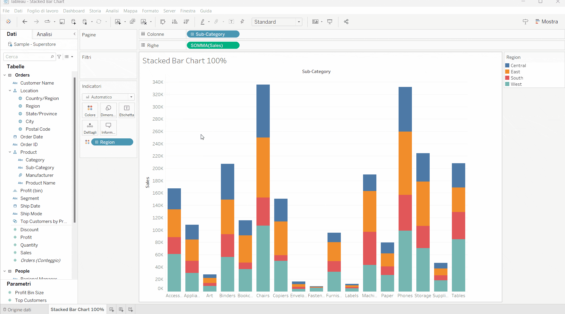
That’s it! You have created a 100% stacked bar chart that you can use to view the additional detail of the percentage of total sales by region in each subcategory.
What is a Stacked Side-by-Side Bar Chart?
The stacked side-by-side bar chart is an extension of the stacked bar chart. This type of chart allows you to compare two or more measures in the same chart. It is particularly useful when you want to break down the bars by an additional dimension on two or more different measures.
How to create it in Tableau
Let’s proceed step by step to create a stacked side-by-side bar chart in Tableau. In the following example, starting from a bar chart, we will see how sales and profits are broken down by the additional category that represents the region in each product subcategory. We will use data from Sample Superstore.
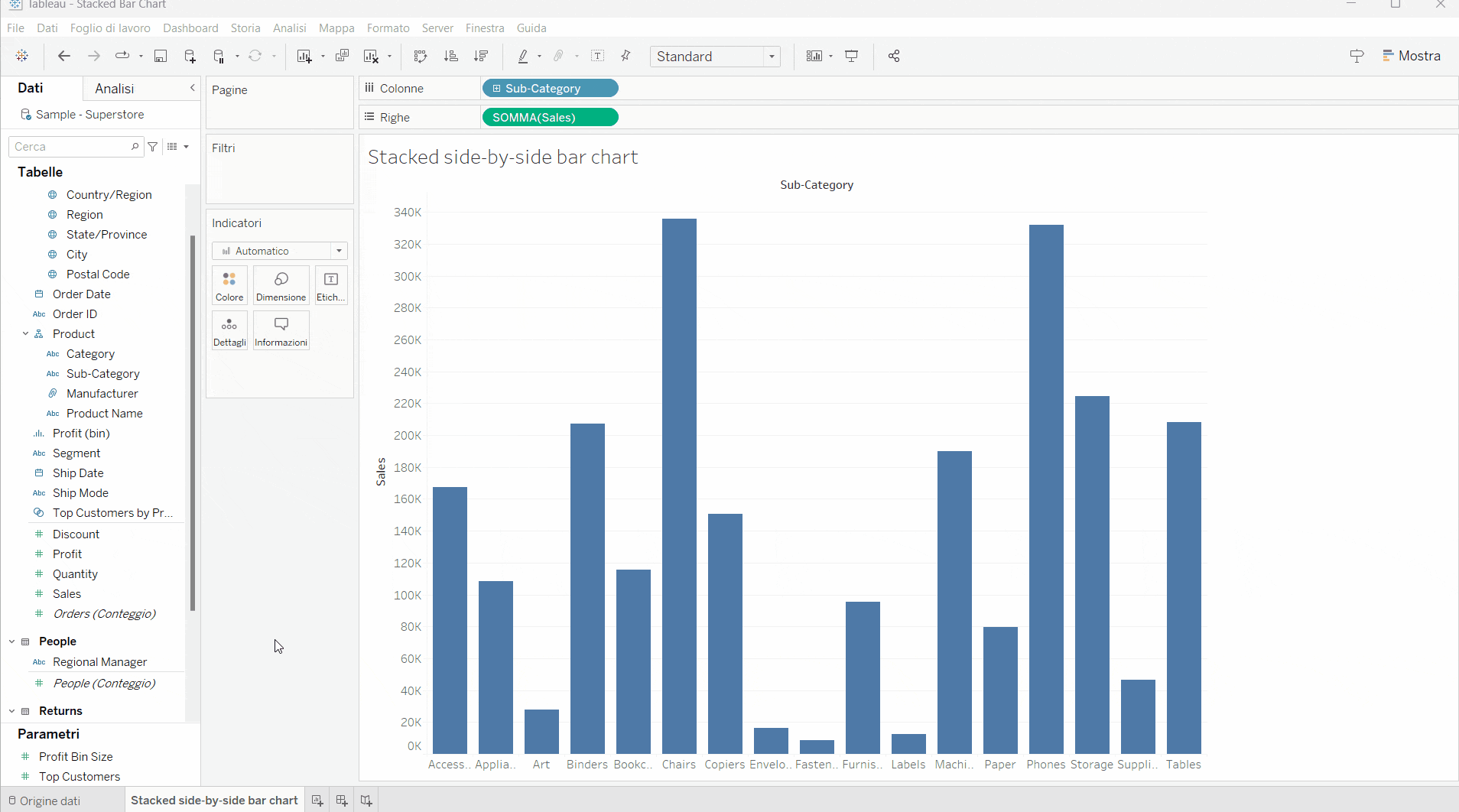
Step 1: Create a bar chart
- See Step 1 in the “How to create a stacked bar chart in Tableau” section.
Step 2: Create a stacked side-by-side bar chart
- Drag the second measure to the vertical axis where two bars appear side by side. In our case, consider the measure Profit.
- Next, drag the Region field to the Color section of the Marks card.
- To better view the newly created chart, select Entire View from the dropdown list on the toolbar.
That’s it! You have created a stacked side-by-side bar chart that you can use to view the additional detail of the breakdown by region of sales and profits in each subcategory.
Conclusions
We have built three types of stacked bar charts that are useful when we want to obtain information about an additional categorical variable. In summary:
- Use the stacked bar chart when you want to compare the information obtained from the classic bar chart by adding the breakdown for an additional category in each bar.
- Use the 100% stacked bar chart when you are interested in knowing how much the sections of the additional category contribute as a percentage to the total in each bar.
- Use the stacked side-by-side bar chart when, in addition to getting the benefits of the standard stacked bar chart, you want to compare two or more measures.
Read all our articles on Tableau
Do you want to discover the latest features or delve into certain functions to become an expert?

Visualitics Team
This article was written and edited by one of our consultants.
Sources:
Build a Bar Chart – www.help.tableau.com
Chart Types: Bar Charts, Stacked Bar Charts, and 100% Stacked Bar Charts – www.support.spreadsheet.com
Creating a Stacked Bar Chart That Adds up to 100% – www.help.salesforce.com
Getting Started with the Percent Bar Chart (100%) – www.community.microstrategy.com
Share now on your social channels or via email: