


A waterfall chart can be used to show either sequential or categorical data. It uses a series of bars that show gains and losses by displaying a running total as values are added or subtracted.
Let us then see how to build step-by-step a waterfall chart on Tableau. Our goal is to create a graph showing the running total of profits per sub-category from the Sample Superstore data source.
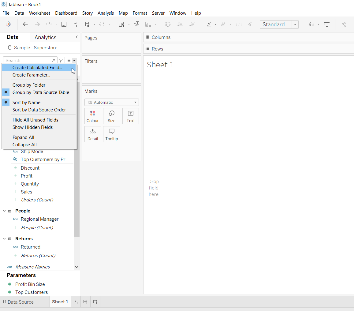
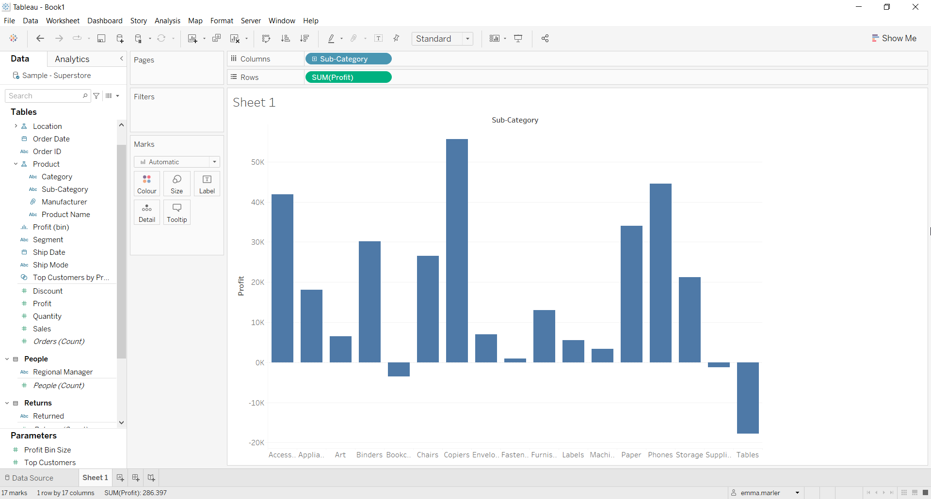
Step 1. Create a bar chart
- Connect to the data source (in this case we are not using Sample Superstore).
- Create a calculated field. Let’s call it Negative profit and type -sum([Profit]).
- Drag Sub-category on Columns.
- Drag Profit to Rows. You will get a standard bar chart with also negative values.
Step 2. Create a waterfall chart
- Right click on Profit in Rows, select Quick table calculation > Running total.
- Select Gantt bar from the dropdown menu in the Marks card.
- Drag the field we previously created called Negative profit on Size in the Marks card.
- Drag Profit on Color in the Marks card. You can change the color palette to make it more effective, for example a two stepped Red-Blue diverging palette.
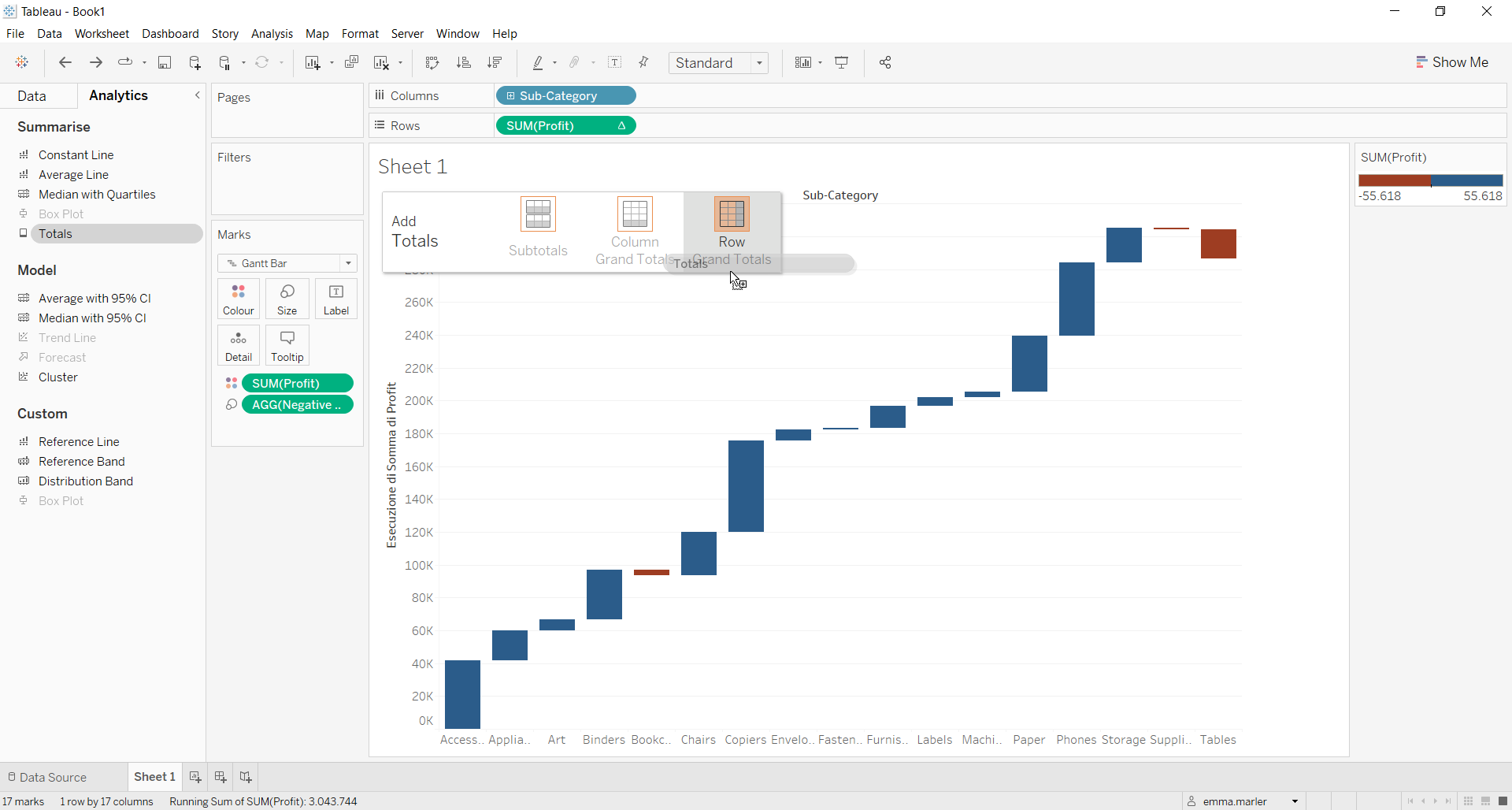
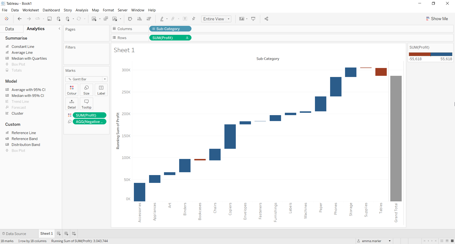
- Click on Analitics in the left pane. Drag Totals on the view and drop it on Row Grand Totals.
- Fit to Entire view. Done!
Don’t wait! Contact us to learn more and continue to follow upcoming news on our website and LinkedIn channel.