


In this article, we will illustrate how to construct a Candlestick chart using Tableau, starting from downloading the data to the creation of specific calculated fields to display price movements, volatility, and trends. We will highlight the importance of this chart in technical analysis, emphasizing how its understanding can significantly improve trading strategies, providing investors with the tools to make more informed and timely decisions in the market.
What is it and when is the Candlestick used?
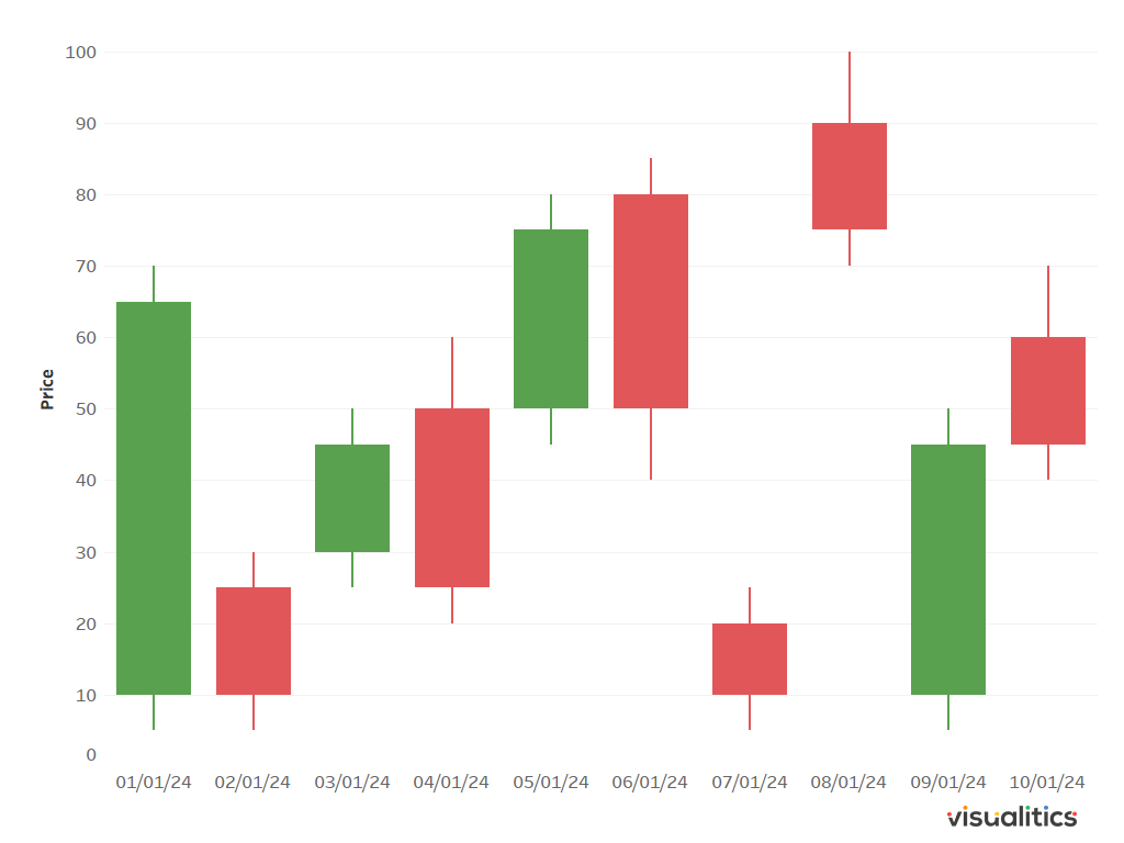
The Candlestick is a type of chart that displays the opening, closing, high, and low prices of a stock within a specific time frame. Each interval, called a candle, is represented by a rectangular shape, known as the body, and by vertical lines above and below the body, called shadows. The body reflects the difference between the opening and closing prices for the period, while the shadows indicate the highs and lows reached during the interval.
Candles can be of different colors, usually green or white to indicate an increase (closing price higher than the opening price) and red or black to indicate a decrease (closing price lower than the opening price). This color representation makes it easy to quickly interpret the direction of price movement.
The Candlestick is widely used in various financial contexts, often in conjunction with other technical indicators to confirm trading signals and make more informed decisions. It is used to search for patterns that indicate the beginning, continuation, or reversal of a trend, but also to assess the volatility of a security thanks to the length of the candles. Indeed, candles with long shadows indicate greater volatility compared to candles with short shadows.
How is it possible to construct a Candlestick on Tableau in a few simple steps?
To build our chart, we will use data that you can easily download from here. Then, just follow these steps to get the visualization.
- Create a calculated field “GAP (Open and Close)”: (AVG([Close])-AVG([Open]))*-1
- Create a calculated field “GAP (High and Low)”: (AVG([High])-AVG([Low]))*-1
- Create a calculated field “Price Movement”: IF AVG([Close]) > AVG([Open]) THEN “Up” ELSE “Down” END
- Drag Date into Columns with the right button and select Date (Discrete)
- Drag High into Rows with the right button and select AVG(High)
- Drag Close into Rows with the right button and select AVG(Close)
- Right-click on AVG(Close) and select Dual Axis, then click on one of the two axes and select Synchronize Axis
- Choose Gantt Bar as the type of visualization
- In Marks, click on AVG(High), drag GAP(High and Low) into Size and then reduce the Size
- In Marks, click on AVG(Close), drag GAP(Open and Close) into Size
- In Marks, click on All and drag Price Movement onto Measure Names to replace it
- Assign green to “Up” and red to “Down”

Conclusions
In conclusion, the Candlestick is a fundamental tool for technical analysis in financial markets. Its ability to provide detailed information in the form of visual patterns makes it a valuable instrument for investors and traders seeking to understand and predict price movements. Learning the various patterns and practicing the interpretation of Candlesticks can significantly improve the ability to make informed trading decisions.
Read all our articles on Tableau
Do you want to discover the latest features or delve into certain functions to become an expert?

Visualitics Team
This article was written and edited by one of our consultants.
Share now on your social channels or via email: