In Data Visualization, it is crucial that dashboards present data in a simple, clear, and effective way. Tableau is an outstanding tool for this purpose, and sometimes knowing a feature or an option can help you achieve your goal quickly and easily, especially when time is limited. In this article, we aim to share the 10 tips and tricks we’ve found most helpful.
If you’ve just discovered Tableau, think of this article as an introduction to its most unique features. If you’re a veteran, check if you know them all!
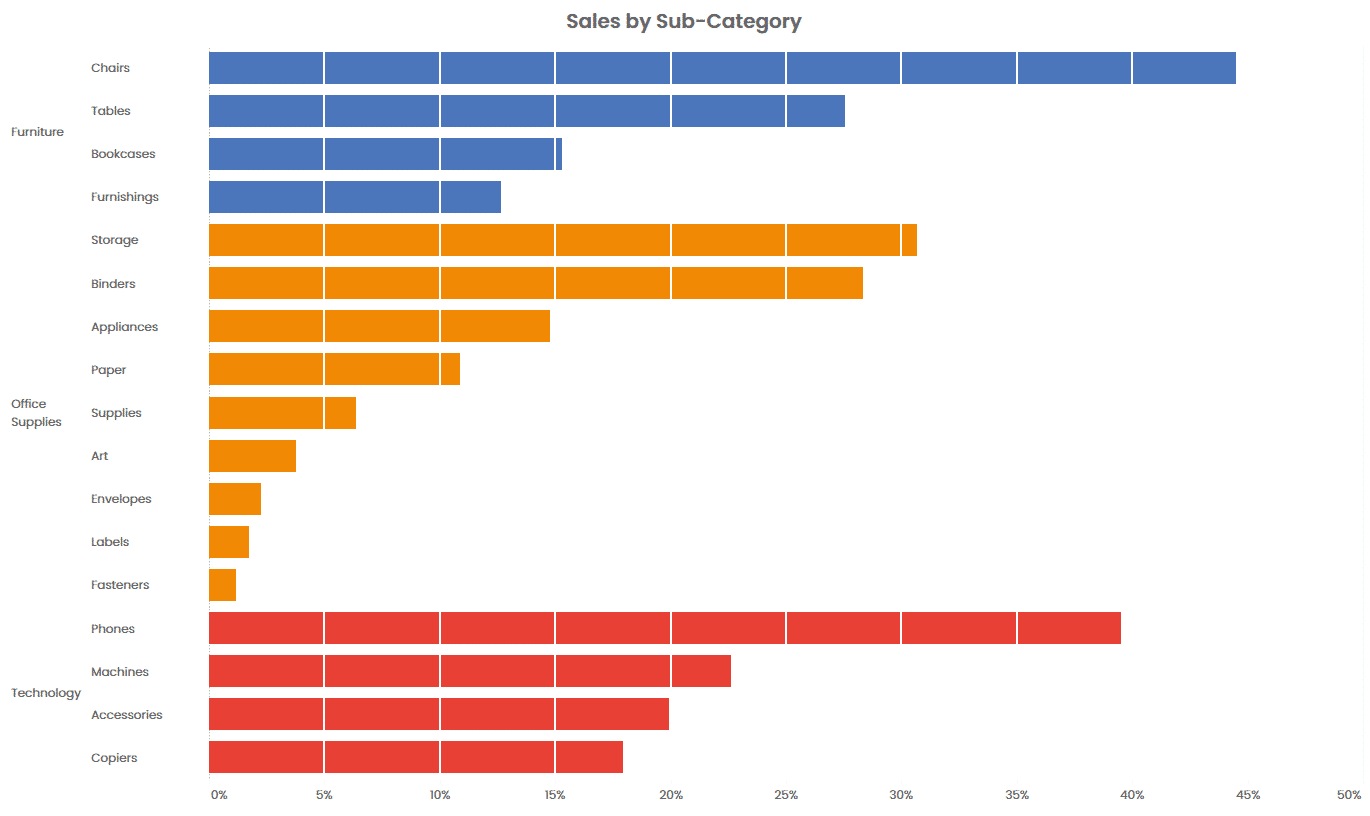
1. Dual Axis Chart – Displaying on a Single Axis
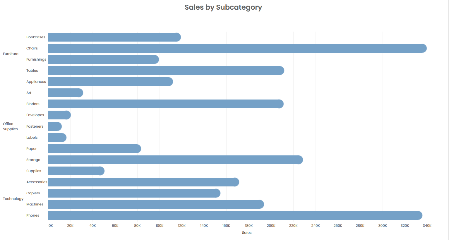
Suppose we want to create a bar chart that shows sales by category and subcategory, as in the following image.
Dual Axis
In this case, the axis is located at the bottom. But what if we wanted to see it at the top?
An easy and fast way to show the axis at the top instead of the bottom is as follows:
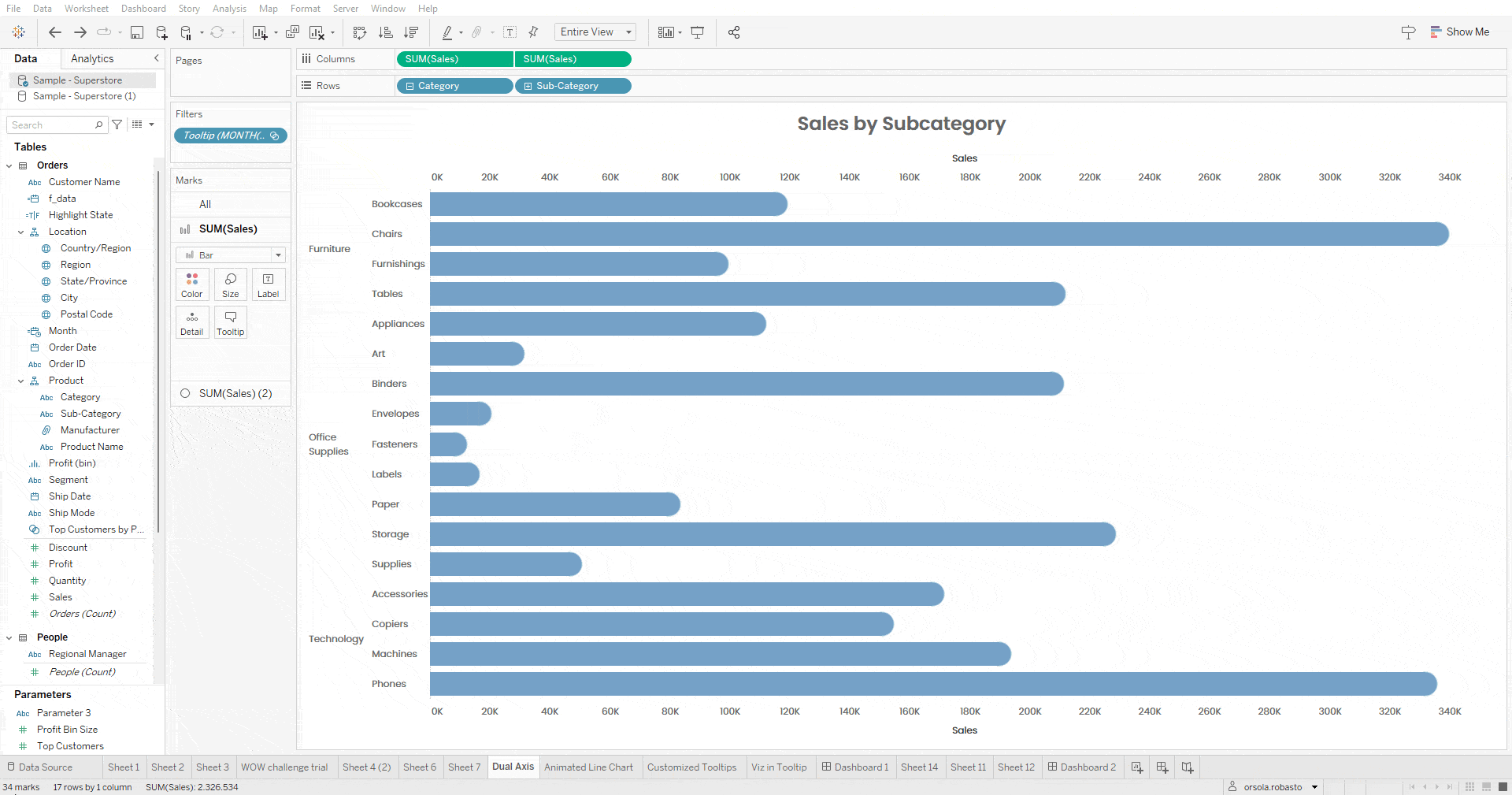
Create a dual axis chart by duplicating the SUM(Sales) pill in Columns.
Right-click on the axis located under the visualization and click on “Edit Axis”.
In the “General” dialog tab, delete the title. In the “Tick Marks” tab, select the “None” option for Major Tick Marks.
Now you will see that the lower axis is no longer visible.
Dual Axis
2. 3 Ways to Add More Pills to the Color Card on the Marks Card
How many times have you wanted to add more dimensions to color but couldn’t manage to do it? Here are 3 simple ways to achieve this:
While holding down the CTRL key, select the different pills you want to add to color and drag them onto the Color Card.
If you already have one dimension on color, click and drag the second pill you want to add to color onto the Detail Card. Then, click on the icon to the left of the pill just dragged and select the ‘Color’ option.
If there’s already one dimension in color, an alternative method is to click and drag the second pill you want to add to color while holding down the SHIFT key.
3. Default Download Button
In the 2020.3 version, Tableau introduced the “Export to Crosstab” button. Once included in a view, this button allows users to download the data used in the view into Excel. When there are multiple visualizations on the same dashboard, the data that will be downloaded will belong to the last chart interacted with, regardless of whether the user is the developer or an external user. To circumvent this issue, the trick is to select the sheet you wish to set as the default and then publish the dashboard so that the data related to the selected sheet is always downloaded.
4. Animate a Line Chart using Pages
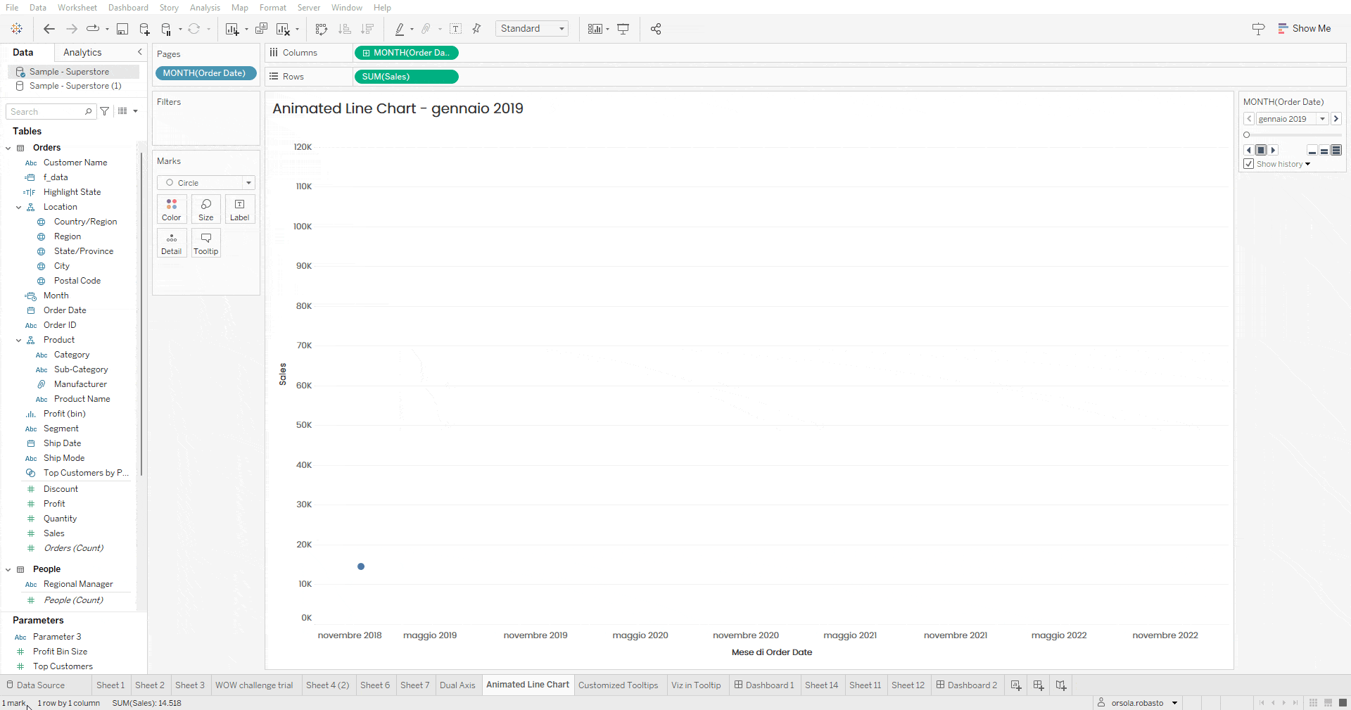
An animated line chart is an excellent way to show the evolution of a measure over time, such as the evolution of SUM(Sales) by month of Order Date. To achieve this, simply follow these easy steps:
Animated Line Chart
Bring Order Date as a measure with monthly granularity to columns and SUM(Sales) to rows.
Bring the Month of Order Date onto the Pages Card.
In the Marks Card, change the type of Mark from Line to Circle.
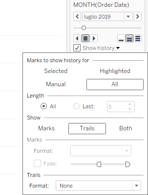
On the Pages Card control panel, select the option Show History and open the corresponding dialogue window by clicking on the arrow to the right of this entry.
In this window, set the options as shown in the following figure (ensuring that the fade option is not selected) to display all marks and their trends.
Once these steps are completed, simply click play to animate the line chart.
Animated Line Chart
5. Convert number format from integers to Roman numerals (and vice versa)
Have you ever wanted to change the number format from an integer to Roman numerals?
Thanks to the reference workbook by Ethan Hahn, you can do it in a few simple steps:
Inside this workbook, the calculated field “Roman Numeral” converts an integer number into a Roman numeral by “decomposing” the starting number. With this field, each digit of the starting integer number (thousands, hundreds, tens, units) is isolated and converted to the corresponding Roman notation. You just need to copy this field into your workbook and point it to the reference numeric field.
Similarly, if you want to convert a Roman numeral into an integer notation, you can use the field “RN to integer.” This field employs logic similar to the former.
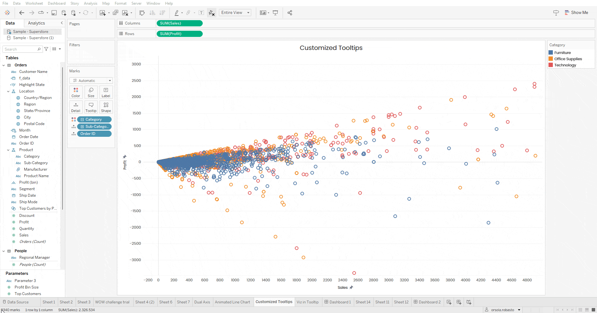
6. Customizing Tooltip Settings
In some visualizations, there may be a need to allow the end user to click on a mark and then click on the related dimension within the tooltip to select all the marks that have the same dimension value.
Allow selection by category
To enable this feature, simply check the “Allow Selection by Category” option in the tooltip settings.
N.B. If you decide to use this option, we recommend formatting the dimension within the tooltip in such a way that it is underlined, thus suggesting a hyperlink (or in any case, clickable text).
Tooltip "Allow Selection by Category"
7. "Break the Code" to find the sheet related to the Viz in Tooltip.
How many times have we been working on a dashboard where a chart has a viz in the tooltip? We’ve almost finished our work, hidden all the sheets related to the dashboard, but then we notice there is a problem with the viz in the tooltip. How do we find the sheet quickly?
To find the sheet quickly, go to the sheet related to the chart containing the viz in the tooltip, select the tooltip card, and “break the code” related to the viz in tooltip by writing any text. By doing this, the sheet related to the viz in tooltip will automatically appear next to the sheet you were working on.
Break the Code
8. Create a stacked bar chart in the Grand Totals column.
Stacked Bar Chart - Single Color
Let’s assume we want to create a bar chart for Region and Category that displays the SUM(Sales). To do this, simply place the Region field in rows, the Category field and SUM(Sales) in columns, and the Category field in color on the Marks card. When we add the Grand Total column, it appears in a single color.
To create a stacked bar chart colored by Category in this column as well, simply duplicate the Category field and bring it into color. By doing this, the color palette used for the Category field will be the same for both the individual columns and for showing the breakdown of the Grand Total in the last column.
Stacked Chart Grand Total - Different Colors
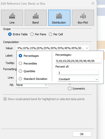
9. How to Create a Unit Chart with a Distribution
The Unit Chart (or Unit Progress Bar) is a type of graph that illustrates the progress status of a measure against a total. In most cases, the lines are set at 10%, 20%, 30%, 40%…100% to facilitate reading the graph.
Unit Chart
One way to create this visualization is to include constant lines at the percentages of our choice. Alternatively, it can be done more quickly by including a single distribution broken down by the percentages of our choice. To do this, you will need to:
Unit Chart Edit Lines
Drag the distribution band onto the chart, select the distribution for the Entire Table.
Set the percentage intervals in which we want to see a distribution line and select 1 as the constant value for “Percent of.”
Set the color of the lines to white (or the color of the background of the final dashboard) and format the color of the bands to no color.
Once all the steps are completed, you can appreciate your Unit Chart.
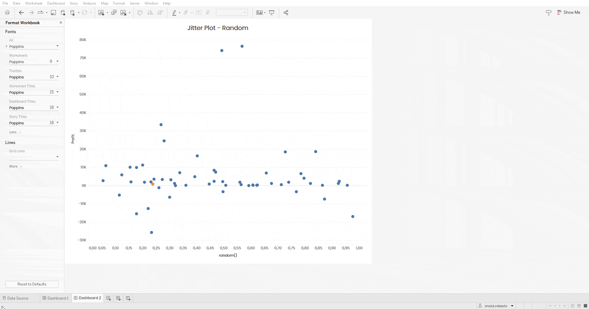
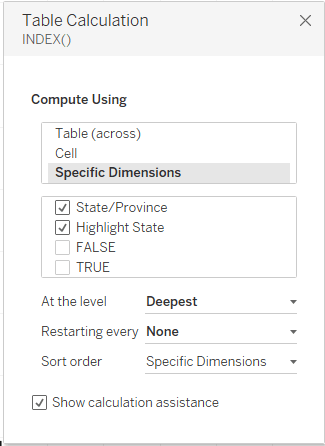
10. How to remove the movement of marks in a jitter plot
Let’s assume we want to create a jitter plot of the States using the RANDOM() function. Then, we set up a parameter action to color the selected state differently. However, when the action is activated, the mark of the selected state and those of all other states shift. To prevent this from happening, we can recreate the same visualization using the INDEX() function instead of RANDOM(). We set the Compute Using to “Specific Dimensions” and select the relevant fields.
Jitter Plot - Random
Jitter Plot
Once all the steps are completed, we can test the interactivity of the dashboard. By selecting a specific state, the marks will remain stationary to facilitate the consultation of the dashboard.
Jitter Plot - Index
Conclusion
Tableau is a versatile and excellent tool for creating effective, self-explanatory, and aesthetically appealing dashboards. Despite its strengths, it also has limitations that can be overcome through complex workarounds or specific tricks. Here we have presented the 10 tricks that we found most useful, and we hope they can inspire you to create new visualizations or refine the ones you already use.
Read all our articles on Tableau.
Do you want to discover the latest features or delve into certain functions to become an expert?