In the article “How to Create a Radar Chart in Tableau (Part 1)” dated November 28, 2023, we described the Radar Chart as a useful graph for representing the characteristics, performance, or generally the values of an element in relation to multiple variables. We also illustrated in a few steps how to create one in Tableau, when the data is structured in a certain way: all the values to be represented are contained in the same column of the source data table.
Creating Radar Charts in Tableau with Data Structured Across Multiple Columns
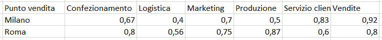
What to do, however, if the data is structured differently? Let’s assume we have a database structured as shown in the image
Data Structure
With this structure, the guide described in the previous article does not work; let’s try to understand why. The reason is purely technical: the calculated field to be written.
Step 1: Data Model
The process to create a radar chart, when the values of the chart’s vertices are divided into columns, requires a few additional steps. Let’s use a practical example to describe these steps.
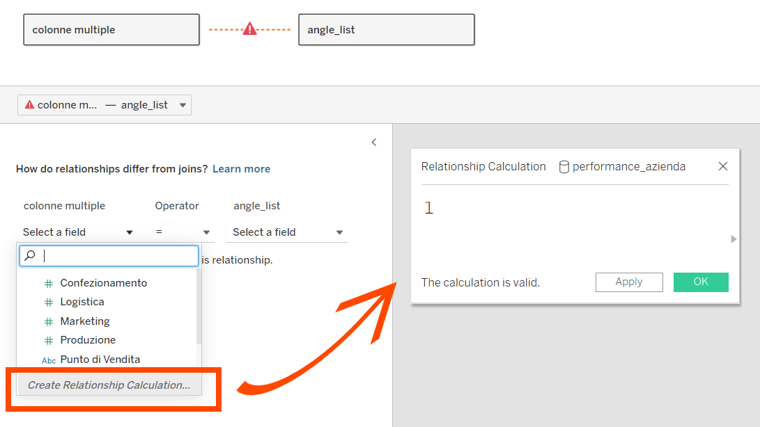
The first step is to add a support table to the data model. We can do this by linking the table containing the data (performance_azienda.xlsx file) with the support table (angle_list.csv). To obtain the support table, read the article to the end… we have created a tool that will be very useful to you!
Between these two tables, there is no relationship key, but we can create one very simply: open the field list of the first table and click on the last option (create relationship calculation) to open a calculated field. Just write 1 and then click OK.
Do the same for the other table. In this way, we have created a relationship key between the two, where each row of the first table is linked with every row of the second table.
Support Table Data Model
Step 2: Calculated Fields
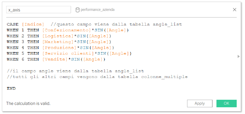
Now go to a worksheet and create a calculated field called x_axis. Write the formula as follows; the number of WHEN statements to insert is equal to the number of measures you need to represent:
Calculated Field
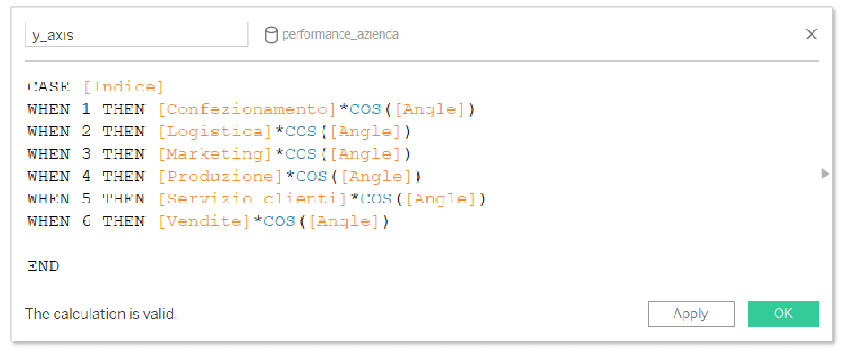
Then create a second calculated field very similar to the first: the only difference is that while before we multiplied the measures by the sine of Angle, now we multiply them by the cosine of Angle:
Calculated Field
Step 3: Creating the Chart
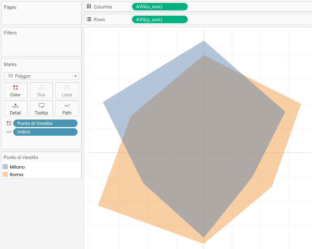
Now we have all the elements to “compose” the radar chart. Set the mark type to polygon, then drag:
The field AVG(x_axis) to Columns
The field AVG(y_axis) to Rows
The field Index to Path
The field Point of Sale to Color
Note: The index field must be a dimension. If it is not, convert it before dragging it onto Path.
Radar Chart
The radar chart is ready! Now all that’s left is to customize and format it to your liking.
Every promise is a debt...
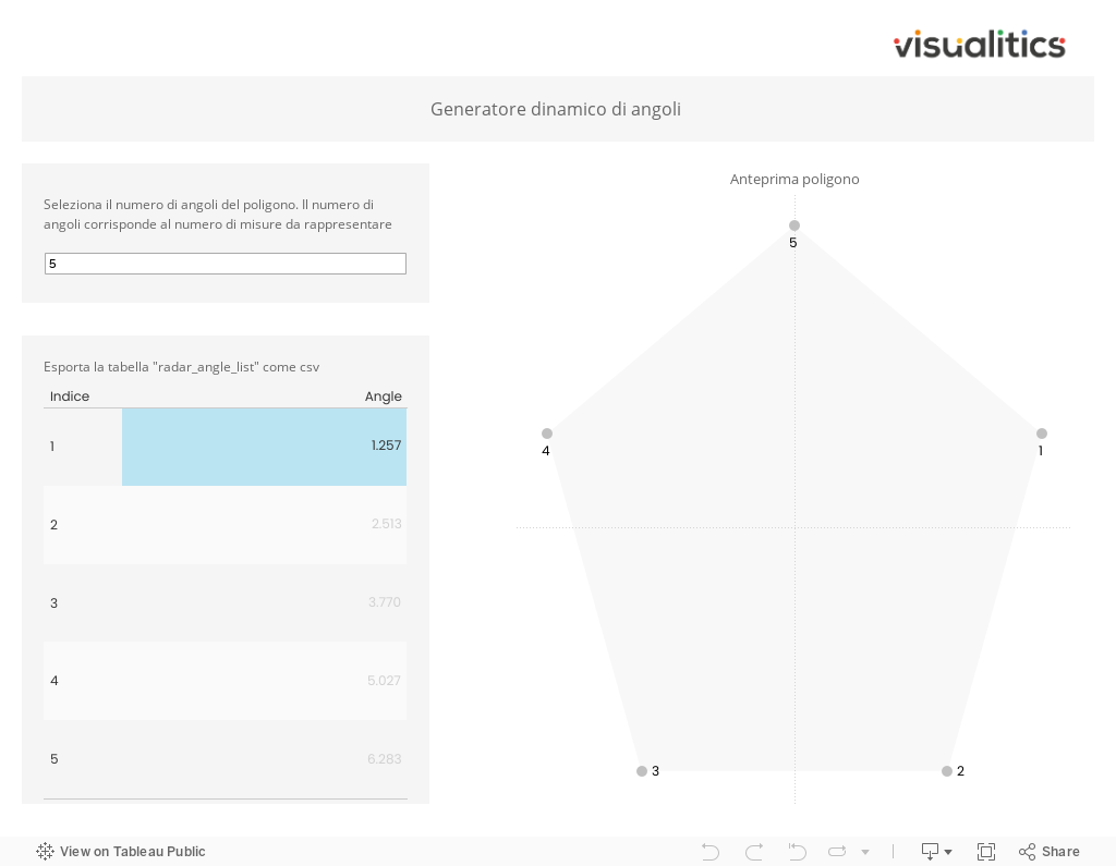
Now that you have the complete guide to create a Tableau radar chart with multiple measures, you can try making one with your own data. The only thing you’re missing is the support table to add to your data model. To make your life easier, we’ve decided to provide our community with a tool to dynamically produce it! The process is very simple: type the number of measures you want to represent on the radar and Tableau will calculate the value of each angle. You can see a preview of the corresponding polygon and a preview of the support table. Export the table in Excel or CSV format, selecting “Cross Fields“, and have fun!
Read all our articles on Tableau.
Do you want to discover the latest features or delve into certain functions to become an expert?