


How to create a calendar in Tableau

Creating a calendar on Tableau can be a great way to visualize a trend in a given month for example. In this case we will create a calendar showing profits in the month of December 2021. Let us then see how to build step-by-step a calendar on Tableau. Step 1. Create the calendar Connect to […]
How to create a stream graph in Tableau
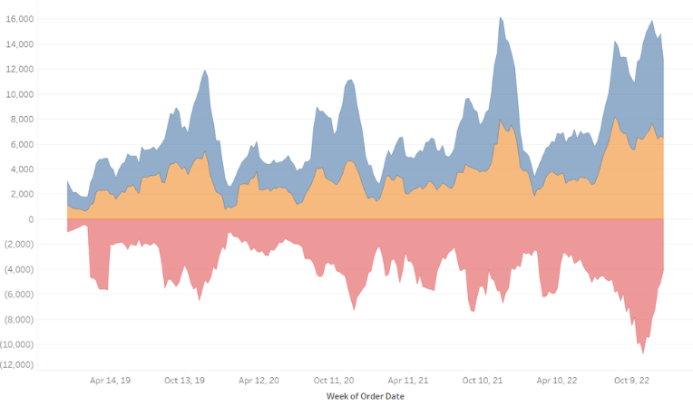
Stream graphs are often used to show changes of different categories over time. The height of each individual stream shape shows how the value of that stream has changed over time. The length of the stream shape shows its duration. Let us then see how to build step-by-step a stream graph on Tableau. Step 1. […]
How to create a Gantt chart in Tableau

The Gantt chart is a graph used primarily to show the duration of certain activities and to plan and/or observe the evolution of a project on a time scale. It consists of a horizontal axis, which represents the total time frame of an event/project, and a vertical axis, which shows the activities that make up […]
How to create a bullet chart in Tableau

A bullet chart is useful to visually track performance against a target, displaying results in a single column. The chart can display one or many columns that can be color-coded Let us then see how to build step-by-step bullet graph on Tableau. Our goal is to create a graph showing whether sales of different product […]
How to create a slope chart with choice in Tableau
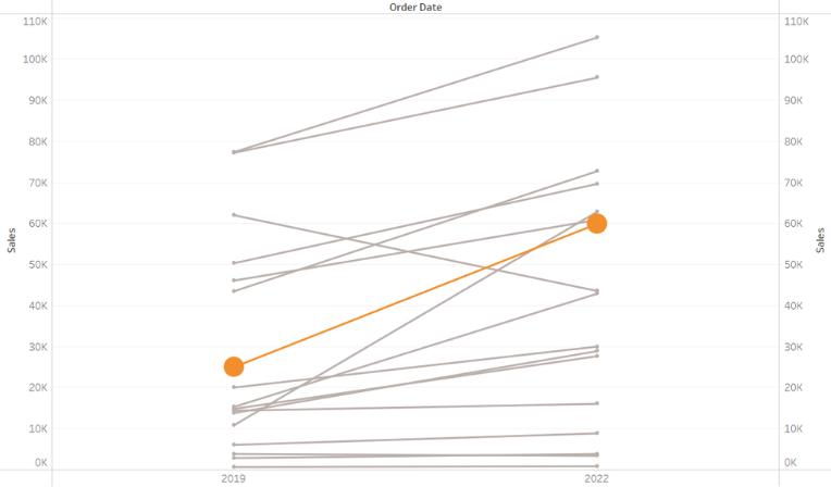
A slope chart can be used to show a ‘before and after’ story of different values, based on comparing their values at different points in time. The related values are connected by slopes. Let us then see how to build step-by-step a slope chart on Tableau. Our goal is to create a graph showing sales […]
How to create a waterfall chart in Tableau
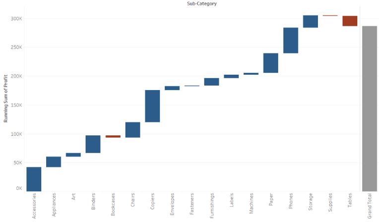
A waterfall chart can be used to show either sequential or categorical data. It uses a series of bars that show gains and losses by displaying a running total as values are added or subtracted. Let us then see how to build step-by-step a waterfall chart on Tableau. Our goal is to create a graph […]
How to create a bar-in-bar chart in Tableau

A bar-in-bar chart is perfect for visualizing your data according to different categories or subgroups. Let us then see how to build step-by-step bar-in-bar chart on Tableau. Our goal is to create a graph showing sales and budget sales per product. Step 1. Create the chart Connect to the data source (in this case we […]
How to create a Pareto chart in Tableau
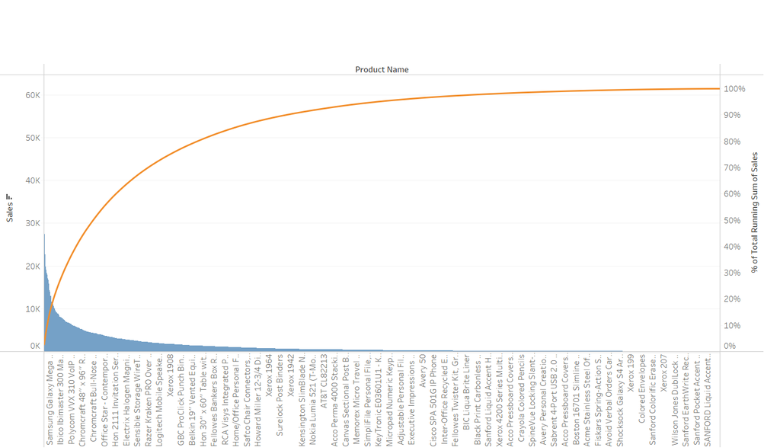
A Pareto chart is a simple bar chart that ranks related measures in decreasing order of occurrence, thereby measuring their frequency, and a line graph, which represents the cumulative total. Let us then see how to build step-by-step pareto diagram on Tableau. Our goal is to create a graph showing the sales of the products […]
How to create a bar chart with two lines in Tableau
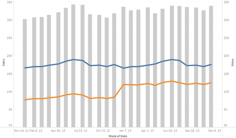
A bar chart with two lines is perfect for visualizing different categories of data at the same time in order to identify trends over a period of time. Let us then see how to build bar chart with two lines on Tableau. Our goal is to create a graph showing profit, sales and margin over […]
How to create a funnel chart in Tableau – part two
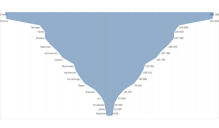
A funnel chart is generally used to visualize how data moves through a process. The chart takes its name from its shape, which starts from a broad head and ends in a narrow neck. Let us then see how to build step-by-step funnel chart on Tableau. Our goal is to create a graph showing sales […]