


Water: analysis of consumption, impacts, and sustainable solutions
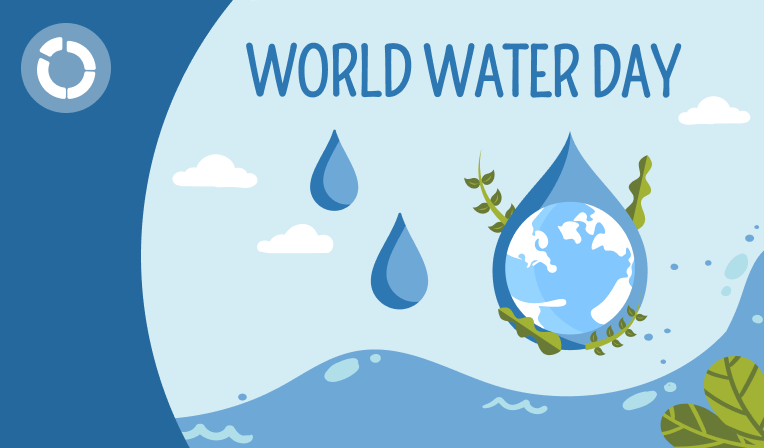
In today’s Visual Story, on the occasion of World Water Day, we analyze the data concerning water consumption across countries, focusing on those primarily responsible for water usage in industrial, domestic, and agricultural sectors. Additionally, we explore the individual water footprint of our daily lives, highlighting differences between direct and indirect consumption: how much water […]
It’s Not a Sanremo for the Old

In today’s Visual Story, we narrate facts and curiosities related to the Sanremo Music Festival through data. Thanks to a series of interactive visualizations, we show you the number of hosts and singers who have participated in the music festival. We then focus on the last 10 editions of the Festival, showcasing the musical genres, […]
30 Years of Conflict in the World

In today’s Visual Story, we narrate 30 years of conflict in the world through data. Thanks to a series of interactive visualizations, we show you the number of armed conflicts, the total number of victims, the impact of wars on the GDP of each country, the danger level of each conflict, and the number of refugees. […]
Christmas 2023: Visualization of Consumption and Shopping Habits

There are now just a few days left until Christmas, one of the most heartfelt and celebrated holidays in the world. For this festivity, we all spend a fair amount of money, time and effort to gather wonderful decorations, surprising gifts and preparing marvellous Christmas Eve dinners, striving to surprise the people we share this […]
Accessibility in Tableau
Web accessibility for people with various disabilities is an increasingly addressed topic. It’s also possible to enhance accessibility in Tableau by creating dashboards that meet everyone’s needs with simple, yet significant, adjustments. Visual disabilities Visual disabilities vary, and there are certain considerations to make reading dashboards easier. For people with low sensitivity to visual contrast, […]
ATP Finals 2023: The Top 8 Tennis Players Head to Turin

Eleven months of hard work, effort, and sweat have led to this moment: the Pala Alpitour in Turin. From November 12th to 19th, the year’s top eight tennis players will compete in the Finals, the most significant tournament after the four Grand Slams (Australian Open, Roland Garros, Wimbledon, US Open). For the third consecutive year, […]
Mental Health & Work

Lately, there’s been a lot of talk about Mental Health in the workplace and the whole idea of Work-life Balance. But how much do we really know about these topics? Let’s dive deeper into this today with the help of an interactive dashboard. Explore our articles on Data Visualization Curious about Data Viz? Explore the […]
Using Icons in UI Dashboard Design
User interface (UI) dashboards are an essential part of modern software applications. They help users to visualize complex data and make informed decisions based on the information presented. One of the most effective ways to enhance the user experience of a UI dashboard is through the use of icons. Icons are visual representations of concepts […]